

We’re starting a new feature here on Chapter Break called Chat About Covers. ‘Cause you know we all judge books by covers, whether we admit it or not. We judge the style, the color and font choices, and just the overall look. That might not keep us from reading the book, but we do still judge.
![]()
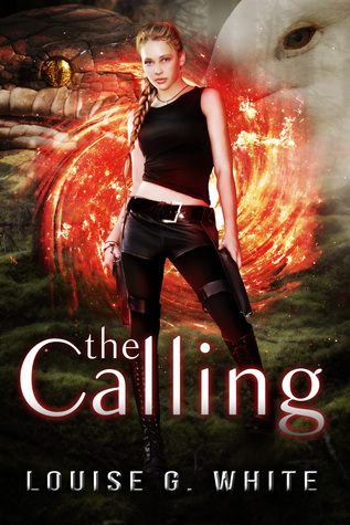
Alright there is just so much going on in this cover that is just so not working.
The girl, looks kinda Tomb Raider-y, appears to be kick-ass awesome. But behind her I’m seeing some kind of portal/vortex/fire?? Is this a weird type of Sliders spin-off? Below the vortex thinger, I’m seeing rolling hills? Smoke maybe? It just isn’t working.
Now, would somebody please kindly tell me what those creepy looking bird and snake things are doing blended into the cover? It just looks so wrong to have weird eyes just, hanging out there, and you really gotta squint and think about what animal they belong to. Just NO.
The fonts look good, though. They stand out from the background well. So, points for that.
![]()
The first thing I notice about this cover is the giant red swirl in the middle. Looks like a portal to travel through space or time. And I’m guessing that’s not the point. Or maybe that is the point? It is “The Gateway” series, after all. But still, red? I’d be worried about bursting into a ball of flames, not being transported through a gateway.
More disturbing, though is the practically “floating” eyes. Is that a snake? And a bird? Fish? Kind of looks like it could be either. And really, what does that have to do with the plot?
And finally, let’s discuss the main character. I guess having a knife and gun strapped down to your thighs would be handy in fighting off the snakes and bird/fish. But the thigh-high stiletto boots? Those don’t seem to practical. But hey, what do I know!
What are your thoughts on this cover?

Ah, Julie. Bringing in the Sliders reference. Great point there!
Yeah, this cover definitely turns me off the book. It’s way too busy – there’s too much going on and I don’t think I’d take the time to try to understand it. I’m with Lynn on the boots…yeah, it’s so easy to run and kickass in heels! 😉 But I guess if you’re running from a bird or a snake or a bird-snake, they might come in handy? You suppose you could stake the snake with your heel.
Bookworm Brandee recently posted…Review ~ Rule ~ Jay Crownover
Oh, Brandee. Your comment had me laughing! I guess if you were running from a bird-snake, those boots could come in handy! Especially for staking.
Covers are definitely important. Because we’re all pretty shallow, right? 😀 But there is truth in that a cover can either grab or repel you from the shelf even before you ever touched the book! I’m not sure about the one above… I’m somewhat tired of pretty girls and various special outfits smiling/glaring/batting eyelashes from above/beneath book titles. I just think there’s room for more, right? Awesome feature idea!
Ramona recently posted…Reading The Classics
Agreed, Ramona, on the “special” outfits. That really just deters me from wanting to read the book!
I hate to be mean, but that is a horrid cover. It makes my eyes want to jump out by just looking at it. Whoever designed this had no idea what they were doing.
This would look a lot better if the fonts were the same. They stand out, yes, but they don’t pair well together whatsoever (from an amateur designer’s POV). Maybe if the weird eyes/animals were taken out and they stuck with one color scheme it would be somewhat pleasing.
Though, some books with the worst covers hold the best plot.
I tend to think a bad cover means a bad plot – especially when it comes to self-published books. Like if they didn’t pay for a good cover design they probably didn’t pay for a good editor. But in the big publisher world, good covers and plot do not always go together.
I love discussing covers! Definitely could do without the whole bird/reptile thing in the back. Unfortunately this looks like something thrown together by several people who couldn’t agree so they added everything. I like the girl- definitely Tomb Raider-y. The boots maybe not.
I always laugh because Kate on Castle wears high heels while chasing criminals, and she isn’t the only one. I can’t remember what crime show it was, but the main female character busted in a door in her 3 or 4 inch heels. Impressive feat if you ask me 🙂
Back to the book. I’m actually impressed with the font given the mishmash up top. They picked a nice, clean font that’s easy to read.
Kimber Leigh Wheaton recently posted…The Stone Legacy Series by Theresa DaLayne
That’s a really good point – it does look like people couldn’t agree so it all went in one stew heh.