

We’re starting a new feature here on Chapter Break called Chat About Covers. ‘Cause you know we all judge books by covers, whether we admit it or not. We judge the style, the color and font choices, and just the overall look. That might not keep us from reading the book, but we do still judge.
![]()
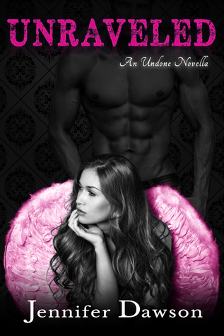
There’s just so much wrong with this cover.
The lady with the bright purple wings looks like she’s really trying to think about something. They are random but pretty I guess.
But that creepy dude in the background? First, he has no head, so he’s all chest and nothing else? Second, the position of the girl’s head in front of his package? Um, either blatant or completely accidental, but it doesn’t work.
I do like the font…
![]()
I love how Julie thinks those purple smears are wings. That is totally not what I see. I see those chocolate-orange slices, the kind that you smash into the table and the segments break apart. The purple smears are really driving me crazy every time I see this cover. What are those things even supposed to be? It’s very distracting against the rest of the black and white cover.
And the floating torso is just weird. I’m hoping the suggestive placement of the female model was an accident. Because, yes, it does not work for me, either.
I’m also completely distracted by the weird wallpaper in the background. It makes me feel like a 70’s-style room. And it’s way too busy for me to look at.
What are your thoughts on this cover?

I think we’re all a bit tired of the sculpted six-packs on book covers, right? It just seems so restrictive, considering the myriad of directions a designer could take… Why get stuck on something so unremarkable and repetitive? I say, meh :/
Ramona recently posted…Be My Bookish Valentine
I saw the purple thing as the back of a chair, too. Like one of those fluffy Papasan ones–I’ve seen bright pink ones at Walmart.
Also, the title of the book looks a little crooked to me.
I just noticed the 70s wallpaper. That’s too funny.
LOL I saw the purple as the back of a chair, actually. And I didn’t really notice the guy or the wallpaper. So… I have actually read the book though and although I don’t get the guy’s placement exactly, I do get the wallpaper and the wings and even the girl in thought. Kimber Leigh is on the money with the model’s placement being naughty. 😉 My favorite part of the cover? The font! 😀
Bookworm Brandee recently posted…That’s What HE Said #51 ~ Thirsty Thursday & Hungry Hearts #32
HA omg Brandee that is some chair you’re picturing!
I think you guys are missing that the chest thing is really her stalker and why she’s in that odd position is because she’s contemplating where he’s stalking her from.
Kayl recently posted…British Blogger: Girl Online
Good point, he totally looks stalkery!
Perhaps she is contemplating his package?
The wallpaper reminds me of the wallpaper/shirt combo from Garden State.
Terri M., the Director recently posted…A Fitting Conclusion to a Magical Series
Ha, I had to Google Garden State to see what you were talking about, I can see that.
The model’s positioning has me thinking something a bit naughty– but I do have a rather dirty mind. She doesn’t seem to notice the stalker in the background or perhaps is perplexed as to why he’s taking so long to do whatever he’s back there waiting to do. I have no words for the purple wings/orange slices…
Kimber Leigh Wheaton recently posted…Earth’s End by Elise Kova – Playlist & Giveaway
No we all thought the naughty thing too heh, dirty mind not required 🙂
I have to say that I kind of saw the purple things as wings too. But looking at it again, I could see the chocolate orange slices! Ha. That cover is just weird. I am not a fan of people’s faces on covers anyway. I like them to be a bit more abstract than that. But to have a face in front of a man’s chest is just weird. And I did not even see the wallpaper at first. Weird.
Cynthia @ Bingeing On Books recently posted…BOOK REVIEW: Room by Emma Donahue
Her face isn’t quite in front of his… chest…
lol, Julie!
HA I didn’t even see the 70s wallpaper over the wings and chest lol. And orange chocolate wedges, I see that now!