

We’re starting a new feature here on Chapter Break called Chat About Covers. ‘Cause you know we all judge books by covers, whether we admit it or not. We judge the style, the color and font choices, and just the overall look. That might not keep us from reading the book, but we do still judge.
![]()
Julie picked a cover she really liked for her birthday, so I’m doing the same for mine! Plus, I’m super excited for the release of this book next week.
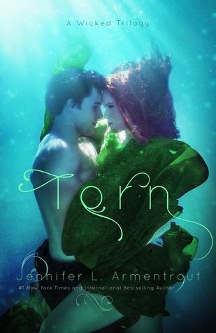
I’m not really sure what water has to do with the plot of Torn. Heck, I thought the same thing for Wicked’s cover. But I love it anyway! I love the floating feel of it. And definitely all of the blues and greens, my fav colors. I love how the light is coming from the top of the photo. I love the vine-y, kelp-ish, font. I think I’d pick up this book to read the back simply based on the front!
![]()
I totally picked up Wicked based on the cover. So sue me. Catchy covers catch me in their nets. In this case, though, agree with what Lynn said – what does this have to do with water? There was no water in the first book. These are not mermaids! Misleading!
I really like the font as it matches with the underwater fairytale theme. That is not what the book is about, but we’re judging the cover so we’ll roll with it. Beautiful font choice. Kind of mysterious in an attention-grabbing kind of way.
I also love the girl’s red hair. Fiery red hair is awesome.
I don’t like the overuse of bubbles. They just seem weird on this cover. They looked better, more natural, on the first book’s cover. The green dress thing looks like seaweed. And not in a sexy seaweed goddess way. I much liked the red dress on the first book’s cover, though.
The green dress thing looks like seaweed. And not in a sexy seaweed goddess way. I much liked the red dress on the first book’s cover, though.
Also, this looks overexposed. Like, way too bright and the subjects are kind of blurred out. Maybe not overexposed as much as over-filtered. Lay off the filters on IG people, and lay off them on some covers.
I’m clearly in a mood! Sorry Lynn!! I did like some of it, though 🙂
What are your thoughts on this cover?


I am so excited for Torn’s release tomorrow! Wicked left off with such a shocker that I’m dying to know how it’s going to sort out. I really love the Wicked cover. Gorgeous. This one for Torn… meh. I love that they match but something about this one just doesn’t look as pleasing to me. I think it’s mainly the green dress. It look PhotoShopped on or something and just looks… not right. How’s that for articulate? 🙂 And I agree with Julie that the colors seem a little garish… too many filers? Too overexposed? Something. Anyway, I don’t dislike it, I just really prefer the Wicked cover. It looked more natural and pretty. Won’t stop me from enjoying Torn, though.
Tanya @ Girl Plus Books recently posted…The Sunday Post #20
Totally agree with you that the first cover was way better.