We’re starting a new feature here on Chapter Break called Chat About Covers. ‘Cause you know we all judge books by covers, whether we admit it or not. We judge the style, the color and font choices, and just the overall look. That might not keep us from reading the book, but we do still judge.


![]()
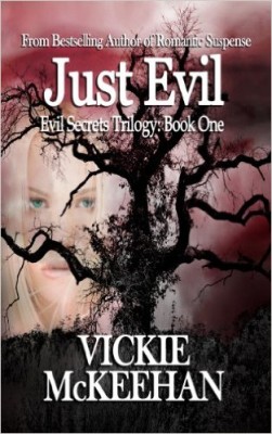
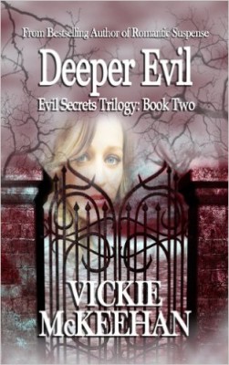
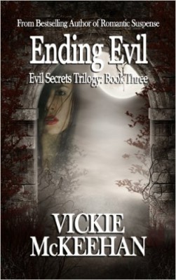
Oh, there is so much wrong with these covers. They took nice-looking stock photos, added creepy floating heads, and difficult to read font. Can we just STAHP with the creepy floating heads? That trend makes no sense to me! The font choice is poor and difficult to read over the busy background. At least it is consistent over the series, so I’ll give it that.
I do want to add that these are the Amazon covers for these books. The covers have been “fixed” on Goodreads and no more creepy floating heads, but Amazon still reflects the original covers I saw for these.
![]()
These covers creep me out. I agree with Julie on stopping with the floating heads. That trend just does not work for me. The covers are too busy. And what’s with the fog? Mist? It definitely ups the creepy factor.
I’m also not likely to pick up, or even read the synopsis of any book with “evil” in the title. I’m sure whatever genre this is – horror? – appeals to some readers. But not me.
At least the font in consistent across all three!
What are your thoughts on these covers?
Note: Some posts may contain affiliate links. Should you choose to purchase a product, we will receive a small commission for the sale at no additional cost to you. Chapter Break is a participant in the Amazon Services LLC Associates Program, an affiliate advertising program designed to provide a means for sites to earn advertising fees by advertising and linking to Amazon.com.


Yeah, I think the covers would be okay if they didn’t have the floating heads…that’s creepy AND distracting. I also agree about the font, Julie. It is hard to read, especially on top of the busy background. I’ve never thought about whether or not I’d pick up a book with a certain word in the title…but “Evil” might steer me away. Hmm…
Bookworm Brandee recently posted…Review ~ Where We Fell ~ Amber L. Johnson
I think book 2 is the worst offender. The decoration appear to be piercing the poor floating head’s nose.
Terri M. recently posted…Scenic Sundays | My Amazing Linn Area Reads Experience
I like the idea they were going for with the gate and the archway. I even get the fog. They are trying to make the cover creepy to go with the evil. I do agree with the floating heads. The book titles aren’t bad to read, but the smaller text is impossible. The author’s name over the gate is difficult. They could’ve done a much better job.
Melanie Simmons @mlsimmons recently posted…Graphic Novel Review: Alias by Brian Michael Bendis, Michael Gaydos (@mlsimmons) #JessicaJones