We’re starting a new feature here on Chapter Break called Chat About Covers. ‘Cause you know we all judge books by covers, whether we admit it or not. We judge the style, the color and font choices, and just the overall look. That might not keep us from reading the book, but we do still judge.

![]()
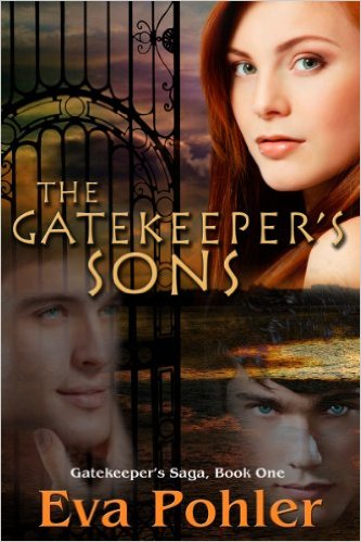
This cover is another offender with the floating heads. WHY THE FLOATING HEADS? Please oh please tell me why cover artists think this is a good idea? It is horrendous looking.
Otherwise, the cover is quite plain. You’ve got the gate, ok, goes with the title. Then there’s the ocean for some reason?
The font is ok for the author’s name. I do like the main title font. I don’t care for the small size of the “Gatekeeper’s Saga, Book One” though.
Yea so overall this one is a fail for me.
![]()
Gah – is that the man on the left’s hand on his own face? Someone else’s hand? Not only is he a floating head, but he comes with a floating hand!
And the water merging into the other guy’s hair is just awful. Is the cover implying that his hair is really water?
I’m with Julie on the what’s with the gate AND the water? If the gate is guarding that much water, it needs to be a lot longer!
I’m not even interested in reading the synopsis for this book.
What are your thoughts on this cover?
Note: Some posts may contain affiliate links. Should you choose to purchase a product, we will receive a small commission for the sale at no additional cost to you. Chapter Break is a participant in the Amazon Services LLC Associates Program, an affiliate advertising program designed to provide a means for sites to earn advertising fees by advertising and linking to Amazon.com.


This is such an interesting idea for a post – because we DO judge books by their covers! And often I don’t think the author gets a whole lot of input into the cover design (although I could be wrong.) I’m not fond of the title font – it looks Egyptian to me, but judging by all the white people on the cover it doesn’t seem like the story is too Egyptian in nature!
jenny @ Unremarkable Files recently posted…9 More Signs Your Kids Read Way Too Much
I took it to look somewhat Greek, and the book contains mythology, so it kind of works.
Lynn, I totally zeroed in on the hand. It’s cropped so weird and I keep staring at it.
Why are some of the heads opaque and others see through? Are they ghosts? Did the designer like playing with opacity in their design program? The gate looks like it stabbing “the Hand Guy” through the eye.
Terri M. recently posted…Scenic Sundays | Light of a New Day
Oh, Terri – you are so correct with the transparency. Someone set that at the wrong percentage! And the gate is stabbing the hand guy through the eye!
omg he’s totally being stabbed through the eye. that just made it so much worse!