We’re starting a new feature here on Chapter Break called Chat About Covers. ‘Cause you know we all judge books by covers, whether we admit it or not. We judge the style, the color and font choices, and just the overall look. That might not keep us from reading the book, but we do still judge.

![]()
I’m going on my sword cover rampage today. I can’t stand sword covers. I’ve complained about them before and even tweeted about it.
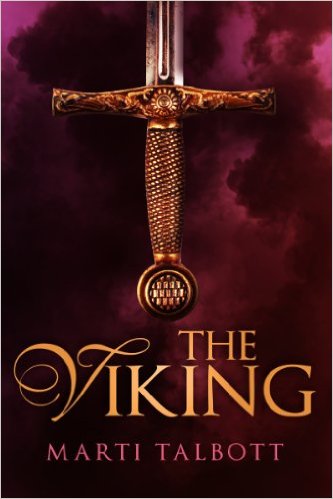
Why is there a trend to have only a sword on a cover? I know nothing about this book by this cover. Other than there is a Viking and he has a Sword. Why is there a sword? Is it a fantasy with magical sword fights? Is this an epic battle over property or pillaging? Probably, because Viking, but still. Give me more on a cover!
I do like the font. And the purple mist is kinda neat.
![]()
I actually like this cover. I would totally pick this book up in the book store and read the blurb on the back! I’m interested in knowing who owns this sword.
I like the daisy/sun indentation in the hilt. It’s probably a sun, as that’s way more “manly”. But hey, maybe this is a woman’s sword and she like’s daisies.
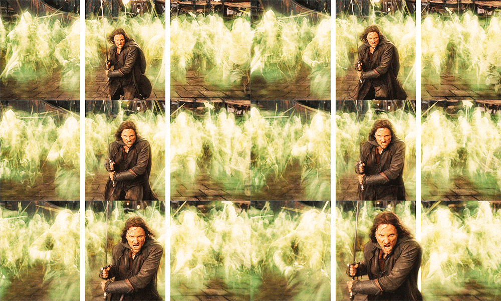
I like the purple mist, too. And I’m hoping this is some sort of fantasy novel about Vikings. Who come running out of the purple mist, with swords drawn, like the dead in Return of the King.

What are your thoughts on this cover?
Note: Some posts may contain affiliate links. Should you choose to purchase a product, we will receive a small commission for the sale at no additional cost to you. Chapter Break is a participant in the Amazon Services LLC Associates Program, an affiliate advertising program designed to provide a means for sites to earn advertising fees by advertising and linking to Amazon.com.


I might pick up this if I saw it in the bookstore but it doesn’t do that much for me. Like Julie, I think the cover isn’t telling me much and I prefer a cover to do that for me. This one…I like the font too. But I see the background as being the sky rather than mist so it looks like there’s a sword hanging, hilt down, from the sky. Huh? The detail on the sword is nice though. And, yeah, it’s about Vikings so I *still* would probably pick it up. 🙂
Bookworm Brandee recently posted…Brandee’s Bookish Babble #16 ~ Me & Facebook
a sword hanging hilt down from the sky would be off – not exactly the way to keep your sword in working order!
I’m not always a big fan of just having a sword on the cover, although I think this one is good as far as that goes. I like the purple too and it looks like storm clouds in the background. Plus it’s a cool looking sword. 🙂
Greg recently posted…Game of Thrones
I agree with you on the sword, Greg!
It is a bit dull to me. Maybe if there were touchy feely stuff on the hilt instead of flat print.
yes, maybe, Tammy. A raised cover is always a plus!