We’re starting a new feature here on Chapter Break called Chat About Covers. ‘Cause you know we all judge books by covers, whether we admit it or not. We judge the style, the color and font choices, and just the overall look. That might not keep us from reading the book, but we do still judge.
![]()
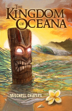
I both like, and don’t like this cover. I like the illustrative nature of it – that it isn’t a real photograph but a sweet artist drawing. I like that a lot. I love the waves, even if they are kind of too colorful. The plumeria on the bottom makes me happy. Because I love Hawaiian flowers.
The Tiki statue, I agree with Lynn, is terrifying. BUT it is kind of supposed to be, since it is an evil spirit causing trouble type of tiki.
I’m not too sure what’s going on in the sky though. Kind of a sunset, but not really? And Lynn is right, is that an eyeball?
The fonts are interesting. I like the top font a lot. But, the bottom font could stand out better against the ocean.
![]()
I’m a big fan of tiki bars, tiki cups, tiki drinks. Or maybe I’ve watched way too many episodes of Hawaii Five-O. But this tiki FREAKS ME OUT. Must be the glowing eyes!
The water is a weird shade. Like if I was at the beach, and the water was that color, I’d be hightailing it in the other direction. And is that an eyeball in the top right corner. WHY IS THERE AN EYE IN THE SKY.
I do like the flower and the sun. I’m going to focus on those instead of the rest of the cover!
What are your thoughts on this cover?
Note: Some posts may contain affiliate links. Should you choose to purchase a product, we will receive a small commission for the sale at no additional cost to you. Chapter Break is a participant in the Amazon Services LLC Associates Program, an affiliate advertising program designed to provide a means for sites to earn advertising fees by advertising and linking to Amazon.com.


Based on the cover, I probably wouldn’t read it. I like that it’s an illustration and I actually really like the colors but the Tiki kinda throws me off. Not all together terrible though!
The illustration is a nice plus over a photo, Ash. We both agree with you there.
It made me think of Scooby-Doo. That’s one of my all time favorite cartoons, so I guess that’s not a bad thing. But I probably would never read this book based on this cover. It immediately screams not one of my genres to read.
I was thinking Brady Bunch. But Scooby Doo applies, too, Livia!