We’re starting a new feature here on Chapter Break called Chat About Covers. ‘Cause you know we all judge books by covers, whether we admit it or not. We judge the style, the color and font choices, and just the overall look. That might not keep us from reading the book, but we do still judge.

![]()
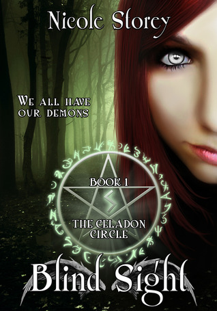
There is just so much going on with this cover it is kind of making me dizzy.
First, the forest. It looks cool, right? It seems to fit the book blurb, about hunting someone in a backwoods cabin. But then, we have this girl face and it is like IN YOUR FACE face and just slapped over the forest photo like BAM. And her yes. OMG creepyfull. Is she the demon?
And then to make it even more complex we have the pentagram and bright colored text with a funky font. I get the pentagram, demons and all, and I like that it is green like the forest and at least fits the style.Now, I like the font, it does look pretty neat. But it doesn’t fit well and the white with black border over the green background just kind of hurts my eyes. And the tag line “we all have our demons” is just too much. Like that extra accessory that turns a look gaudy.
And can someone explain the random wings behind the book title name at the bottom? It just is not working! Talk about taking so many different styles and meshing them together.
Thumbs down for me.
![]()
My initial reaction to this cover is all sorts of no. I’m not even sure that face is human. Definitely not natural looking. Even without considering the eyes.
The pentagram is a major turn off for me. And what’s with the circle of symbols? It makes me think there is a secret message on the cover, and I’m not in the know on the secret.
I do like the forest and the font. Those are both ok. If we removed the face and pentagram.
Julie does have a point about the wings. What is up with that?
Definitely a hard pass for me.
What are your thoughts on this cover?
Note: Some posts may contain affiliate links. Should you choose to purchase a product, we will receive a small commission for the sale at no additional cost to you. Chapter Break is a participant in the Amazon Services LLC Associates Program, an affiliate advertising program designed to provide a means for sites to earn advertising fees by advertising and linking to Amazon.com.


