We’re starting a new feature here on Chapter Break called Chat About Covers. ‘Cause you know we all judge books by covers, whether we admit it or not. We judge the style, the color and font choices, and just the overall look. That might not keep us from reading the book, but we do still judge.

![]()
I’m quite a bit mixed up about this cover. I see it a lot because it is constantly coming up as a free book. But the cover? Well let’s have a go at it.
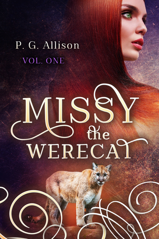
The top half of the cover is actually quite decent. I like the funky star-filled pattern background and the girl’s face is alright. I like the sleekness of her hair and her bright green eyes. I like the font as well for the book title – it looks good on the cover.
Then there’s the awkward bottom half. Weird leopard cat just hanging around? I get the werecat reference, but it just looks off. And really, those swirly brush strokes? Just, no.
So overall a fail but it really tried to succeed.
![]()
I like the font as well. And I like those swirly strokes at the bottom. That’s about all I like about this cover.
The leopard looks like a weird Photoshop cut and paste. The sharpness of the model’s features is not in the least bit appealing to me. And her hair flowing into the bottom of the cover is just awkward.
Overall, it looks like two separate ideas shoved together to me. Much like the whole werecat idea.
What are your thoughts on this cover?
Note: Some posts may contain affiliate links. Should you choose to purchase a product, we will receive a small commission for the sale at no additional cost to you. Chapter Break is a participant in the Amazon Services LLC Associates Program, an affiliate advertising program designed to provide a means for sites to earn advertising fees by advertising and linking to Amazon.com.


I’m the same, the font is the only part that really works for me. I’m not a fan of seeing people’s faces on covers and I agree that there is something slightly off about it.
I don’t mind the top half or the font but I also think that the two halves don’t mesh. It’s just weird. :/
Bookworm Brandee recently posted…That’s What HE Said #71 ~ Thirsty Thursday & Hungry Hearts #52