We’re starting a new feature here on Chapter Break called Chat About Covers. ‘Cause you know we all judge books by covers, whether we admit it or not. We judge the style, the color and font choices, and just the overall look. That might not keep us from reading the book, but we do still judge.

![]()
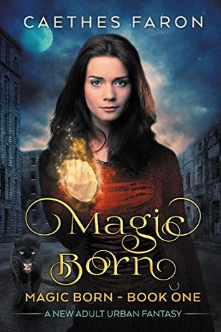
So creepy hand yep. Very awkward looking. And the girl herself? What is up with her expression? Is she supposed to be some powerful magic user, or just some lost child?
Agree with Lynn about the panther as well. Just randomly hanging out beside her. I guess it must be the familiar, all witches have a cat familiar, right?
The city scene looks fine I guess. I do like the font. And the moon. And that’s about it.
![]()
The first thing that strikes me about this cover is her hand. What’s up with that? It looks pretty creepy. I guess we are to assume she’s performing magic. But maybe magic is not supposed to be captured in a still photo. And what’s up with the panther? Are panthers familiars now? I don’t think I’d want to curl up with one.
I do like the curly font on the title. It gets my attention and makes me want to at least read the synopsis.
What are your thoughts on this cover?
Note: Some posts may contain affiliate links. Should you choose to purchase a product, we will receive a small commission for the sale at no additional cost to you. Chapter Break is a participant in the Amazon Services LLC Associates Program, an affiliate advertising program designed to provide a means for sites to earn advertising fees by advertising and linking to Amazon.com.


I like the font that is used for the title. I hadn’t noticed her hand at first- but did go back after reading the comments. Guess it must tie in to her doing magic. 🙂
Is it just me or does she look like Abigail Spencer (the actress that plays Lucy in Timeless)?
Terri M. recently posted…My Ideal Writing Space | Guest Post by Caroline Healy
This one’s okay with the moon in the background and the panther, but yeah I’m not sure what’s up w/ the hand. I guess she’s casting a spell?
I didn’t even notice the moon in the background. Good call, Greg!
I wasn’t bothered by the hand until you pointed it out!
lol. Sorry, Joood!
Yeah, the first thing I wondered was what was up with the girl’s expression as well as her hand. Honestly, I didn’t even notice the panther. Had to go back and look after I saw the mention! *ha* I do like the font and the background though. I think the cover would be better served to take off the girl and panther and just leave the atmospheric town scene…
Bookworm Brandee recently posted…That’s What HE Said #74 ~ Thirsty Thursday & Hungry Hearts #59 ~ Bounty by Kristen Ashley
That’s a good idea, Brandee! I think the cover would look better without the girl and the panther!