We’re starting a new feature here on Chapter Break called Chat About Covers. ‘Cause you know we all judge books by covers, whether we admit it or not. We judge the style, the color and font choices, and just the overall look. That might not keep us from reading the book, but we do still judge.

![]()
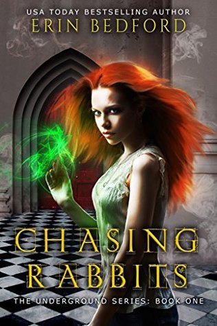
Some previous versions of this cover are on the bad side but this current one is quite nice actually. I’m intrigued by the premise – I do love Alice in Wonderland topic spin-offs.
I liked the checkered floor and the doorway – how it looks bigger and smaller – that’s a great touch. The font is great. Easy to read and stands out.
The girl is interesting, I like that she’s not a blonde here. Curious about the green light, magic? Good thing it was a freebie and I grabbed it. I want to read this ha.
![]()
On the other hand, I am not impressed with this cover. I also abhor Alice in Wonderland. At least the original. I steer clear of the retellings.
I find the whole cover difficult to look at. I wouldn’t want to look at it on my shelf! The green (magic?) clashes with her orange hair. The floor is vertigo-inducing. And I find the title font distracting and difficult to read.
This cover is definitely an example of to each her own!
What are your thoughts on this cover?
Note: Some posts may contain affiliate links. Should you choose to purchase a product, we will receive a small commission for the sale at no additional cost to you. Chapter Break is a participant in the Amazon Services LLC Associates Program, an affiliate advertising program designed to provide a means for sites to earn advertising fees by advertising and linking to Amazon.com.


