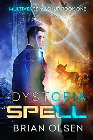
We’re starting a new feature here on Chapter Break called Chat About Covers. ‘Cause you know we all judge books by covers, whether we admit it or not. We judge the style, the color and font choices, and just the overall look. That might not keep us from reading the book, but we do still judge.

![]()
OK so as a mashup this is quite awesome. It is half sci-fi alien adventure and half dystopian looking futuristic city society. I don’t know how well the book will pull off the mashup of genres, but I think the cover does a fun job of it. I like the jagged line that still seamlessly blends the two worlds around the main character’s figure.
I don’t really like the bright light circle things though, and one is around his face so that is kind of awkward. I think those could have been left out and the cover would have looked better.
I do like the font, while “SPELL” is in the cliche type font for scifi, I like that the font on the rest of the tittle is different, but compliments it well.
But, I do think there is font overload. It looks like each set of words has a separate font, and that is a bit much. The font on the top of the book for “multiverse” is again a different looking font, with funky letter “M” that distracts to me.
Overall, not too bad for a mashup type cover.
![]()
I get the whole “mashup” situation right away looking at the cover. But overall, I find the cover busy. It’s painful for me to look at. I think I’d like either cover on it’s own, but not shoved together.
I do like how the mashup design is carried over into the type, with the opposite colors on the two sides of the cover. And I like the bright circle things. They remind me of moons or planets.
Overall, I’d pick the scifi city-scape over the sun-drenched dystopia side. I think the blues and blacks are more appealing than the oranges and yellows.
What are your thoughts on this cover?
Note: Some posts may contain affiliate links. Should you choose to purchase a product, we will receive a small commission for the sale at no additional cost to you. Chapter Break is a participant in the Amazon Services LLC Associates Program, an affiliate advertising program designed to provide a means for sites to earn advertising fees by advertising and linking to Amazon.com.


I’m with Lynn, this cover is too busy. My eyes keep going to the “rip: that goes through his temple and into his shoulder. My head can’t make sense of that at all!
Terri M., the Director recently posted…How Not to Meet a Celebrity. My Exciting Adventures at Phoenix ComiCon.
I’d pass on this one. Visually it’s not pleasing enough, so it’s a miss for this book hoarder.