We’re starting a new feature here on Chapter Break called Chat About Covers. ‘Cause you know we all judge books by covers, whether we admit it or not. We judge the style, the color and font choices, and just the overall look. That might not keep us from reading the book, but we do still judge.

![]()
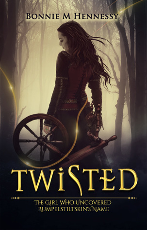
This is kind of an interesting cover that caught me eye. And a freebie might I add.
I kind of like the kind of creepy dark feel of the cover. The girl looks mysterious and I kind of want to know more about this fae retelling version. But at the same time, the dark forest cover theme is overdone.
The font, I like. Bold, gold, twisty. Yes, literal, but it fits.
The placement of the spinning wheel is kind of weird to me. It just hangs out in the foreground. It doesn’t work. She isn’t touching it. I don’t think at least. But it’s like on her?
A so-so cover. Enough to get me to click and read the blurb.
![]()
What’s with the weird shaped S in Twisted? Looks like a sideways genie lamp or a pipe? If the title is implying twisting, why un-twist the S?
I’m weirdly intrigued by the gold thread the winds it’s way from right to left, top to bottom, linking the cover model to the spinning wheel. Definitely feels Rumpelstiltskin-ish.
I could do without the creepy woods and fog in the background.
I do like the cover model’s looks. The clothes she is wearing remind me of something Hermione might wear, Gryffindor colors and all.
I agree with Julie. So-so cover, but interesting enough to get me to click on it and read more.
What are your thoughts on this cover?
Note: Some posts may contain affiliate links. Should you choose to purchase a product, we will receive a small commission for the sale at no additional cost to you. Chapter Break is a participant in the Amazon Services LLC Associates Program, an affiliate advertising program designed to provide a means for sites to earn advertising fees by advertising and linking to Amazon.com.


