Let’s chat about those books that really *really* should have had a cover change.
![]() Julie:
Julie:
If you’ve been following along recently, you’ve seen our awesome Cover Chat posts. Some covers are great, some are horrendous, and some we disagree on haha. I stand behind my comments and there are surely some that could benefit from a completely different cover. In order to not have this be a repeat, I’ll pick a book that we read a long time ago and haven’t discussed as part of that series.
We read Rules in book club some time ago. And reviewed it if you’re interested. In fact, this book seems to have had a cover change, according to the Amazon listing. Good, cause seriously, this is such a generic cover and meaningless.

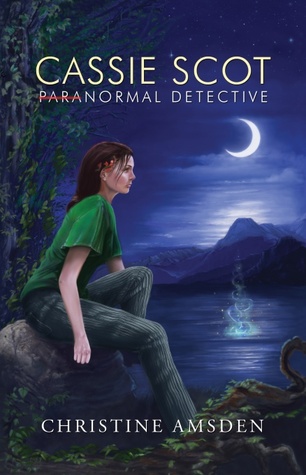
Here’s another read a long time ago, Cassie Scot: Paranormal Detective. It is quite bland as a cover, but the story itself was really good. This whole series is great but the covers are unfortunate haha. It would definitely benefit from a more exciting cover.
![]() Lynn:
Lynn:
Covers do draw us in right away, be that good or bad. And I totally agree with Julie’s choice of The Rules. I really liked that book. But the cover did not do it justice!

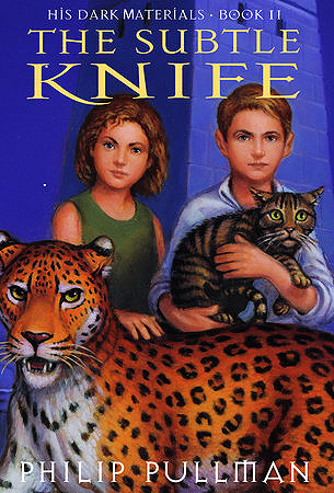
This book does have other covers, but this one grates on my nerves. It looks like a child drew it. That’s probably the point,but it doesn’t draw me in. I wouldn’t want to look at it on my book shelf. Would it even draw in the intended young adult audience?

I want book covers that tell me something of the story. And yes, I suppose this one does, given that the title Sahara and the desert sand definitely imply a stint in the desert. But I also know this is a Dirk Pitt book. Dirk Pitt books deal with WATER. Not sand. I think if I were new to the series, this cover wouldn’t give me enough information to draw me in to read the blurb on the back.
How about you? Are there any books you can think of that could use a cover update?
Note: Some posts may contain affiliate links. Should you choose to purchase a product, we will receive a small commission for the sale at no additional cost to you. Chapter Break is a participant in the Amazon Services LLC Associates Program, an affiliate advertising program designed to provide a means for sites to earn advertising fees by advertising and linking to Amazon.com.


Totally agree with you on all these covers—especially The Subtle Knife. I agree that it looks way too childish.
Nicole @ Feed Your Fiction Addiction recently posted…September Discussion Challenge Link-Up & Giveaway
I hate that so much when good books have rubbish or bland covers!
Personally I’ve been kind of hoping for a while that Juliet Marillier’s books would get a cover change. My copy of Daughter of the Forest is a really nice modern looking one, but literally every other book I’ve seen by her has these really dull, old-fashioned looking covers. And her books are amazing, so it seems like such a shame!