We’re starting a new feature here on Chapter Break called Chat About Covers. ‘Cause you know we all judge books by covers, whether we admit it or not. We judge the style, the color and font choices, and just the overall look. That might not keep us from reading the book, but we do still judge.

![]()
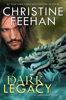
Eep. I am so not a fan of bad overlay blends with floating heads. There’s the random human head AND then there’s the random dragon head. Oh gosh and the lightning coming from nowhere hahaha.
Ok but I do like the font of the Dark Legacy title. The color is great too, gold, but not too bright. I’ll just say that one as a positive.
Would I pick this up? Nope.

![]()
I’m with Julie on the bad overlays. The individual components are ok, but not mashed together. I totally dig that gargoyle, but I don’t know what it has to do with the vampire story line. I feel like the lightning is a substitute for the man’s shirt, or is representing his shirt? Overall, there is way too much going on and I don’t know on which element to focus.
Seeing that this is #27 in a series, I’ll take a hard pass on Dark Legacy as well.
What are your thoughts on this cover?
Note: Some posts may contain affiliate links. Should you choose to purchase a product, we will receive a small commission for the sale at no additional cost to you. Chapter Break is a participant in the Amazon Services LLC Associates Program, an affiliate advertising program designed to provide a means for sites to earn advertising fees by advertising and linking to Amazon.com.


Nay, not my style either. Looks cheesy
I don’t like actual faces used either – prefer art
Erin @Paperbackstash recently posted…Clive Barker’s Hellraiser Vol. 1
Art is a lot more appealing for me as well, Erin!
Ditto! I’m not much of a long series fan with the exception of the Black Dagger Brotherhood series by JR Ward. One very long series is all I can handle. I read a few of Christine’s early vampire novels back with vamp romances weren’t as common, but they quickly seemed repetitive to me and I stopped reading the series probably around book 4.
Ugh. Repetitive books are not my thing either, Livia! Good point!