We’re starting a new feature here on Chapter Break called Chat About Covers. ‘Cause you know we all judge books by covers, whether we admit it or not. We judge the style, the color and font choices, and just the overall look. That might not keep us from reading the book, but we do still judge.

![]()
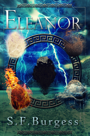
Here we go with more floating shapes. I typically don’t like random floating objects, especially faces, but here it kind of works in a way (just not enough). They are arranged along the circle and kind of do sell the whole elements vibe. But, maybe some fading and editing could have made it less, awkward.
I definitely can tell the plot of this book is about magic, but there is too much going on in the cover and it kind of just draws my eyes all around.
I do like the fonts of the title and author’s name, but they take a backseat to the overwhelming elemental magical storm going on in the middle, which is not the ideal. I think the title and author need to be more prominent.
![]()
Ugh. My immediate thought is way too busy! And poor photo-shop blending.
I could do without the floating rocks. I think the cover would look a lot better without them, just focusing on the ring in the center.
I do like the lightning; it brings some cool colors to the cover. Though I am confused by the forest of trees on the right side. I am wondering if the book is about different elements, but not sure which element trees fall under?
I agree with Julie on the author’s name and title. These really should be the prominent feature of the book.
What are your thoughts on this cover?
Note: Some posts may contain affiliate links. Should you choose to purchase a product, we will receive a small commission for the sale at no additional cost to you. Chapter Break is a participant in the Amazon Services LLC Associates Program, an affiliate advertising program designed to provide a means for sites to earn advertising fees by advertising and linking to Amazon.com.


I like the colors a lot! Thanks for sharing. I try not to judge books by covers- but I know that I do. ?