It’s time again for Chapter Break’s Chat About Covers. ‘Cause you know we all judge books by covers, whether we admit it or not. We judge the style, the color and font choices, and just the overall look. That might not keep us from reading the book, but we do still judge.

![]()
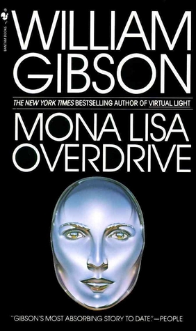
*Shudder* this creeps me out so much! First, I don’t like the harsh white text on black background. That’s just too cheap looking and hard on the eyes. I like covers that have something on them. Not just a creepy robot face mask thing? The facer itself looks interestingly rendered, definitely something artistic to it, but more creepy than intriguing. I assume a robotic theme.
Text – well can we use fonts that go well together, but not the exact font throughout? The People quote does not need to be in ALL CAPS. And I like when the author’s name is different slightly from the title.
This one is a no for me.
![]()
Is it just me or are the “cheekbones” on this cyborg distracting? They are all I see when I look at the face. The whole flattened out face look is not for me!
I do like the stark colors and fonts. The author and title really stand out.
Overall, I’m ok with this cover. It clearly states what the book is about – cyborgs!
What are your thoughts on this cover?
Note: Some posts may contain affiliate links. Should you choose to purchase a product, we will receive a small commission for the sale at no additional cost to you. Chapter Break is a participant in the Amazon Services LLC Associates Program, an affiliate advertising program designed to provide a means for sites to earn advertising fees by advertising and linking to Amazon.com.


Ya, I’d prefer if the authors’ name was smaller and AFTER the Book Title AND in another font. Definitely. It’s nothing fancy and I would not pick it up lol, However, knowing it was about cyborgs …. perhaps. It’s actually a pretty cool title.
oh yeah, Jackie. That’s a good point!