We’re starting a new feature here on Chapter Break called Chat About Covers. ‘Cause you know we all judge books by covers, whether we admit it or not. We judge the style, the color and font choices, and just the overall look. That might not keep us from reading the book, but we do still judge.

![]()
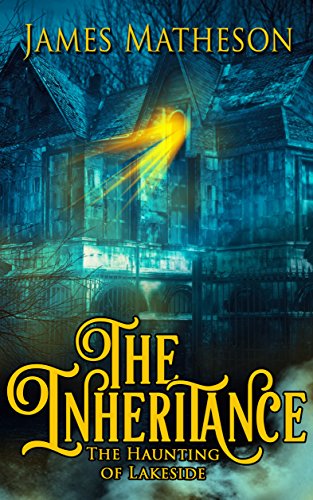
So we have a book about a haunted house, right? Check, the house is on the cover. Ok so actually I kind of like the creepy light that actually looks like it is physically sticking out of the house. That’s a cool effect. Everything else? I don’t like so much. The overall is too washed out of a green color. The house doesn’t pop, it just kinda blends into the background. The trees surrounding it should have a creepy feel, right? But they just kind of get lost.
The font, I do like. For the word Inheritance. It’s kinda neat, not the usual blocky font we see. But it’s SO FREAKING BRIGHT yellow, which is overkill on the muted background image.
I would give this a pass just based on the cover.
![]()
I like the font on Inheritance as well. And could also do with less yellow. It’s like the title is screaming at me. Way too loud.
I am definitely getting the whole haunted house vibe, in a Scooby Doo kind of way. The picture feels very 70’s. And I’m waiting for Shaggy and Scooby to come running out of the house while being chased by the local ghost.
I’m passing on this one as well for the high creeped out factor.
What are your thoughts on this cover?
Note: Some posts may contain affiliate links. Should you choose to purchase a product, we will receive a small commission for the sale at no additional cost to you. Chapter Break is a participant in the Amazon Services LLC Associates Program, an affiliate advertising program designed to provide a means for sites to earn advertising fees by advertising and linking to Amazon.com.


