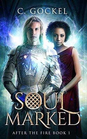
We’re starting a new feature here on Chapter Break called Chat About Covers. ‘Cause you know we all judge books by covers, whether we admit it or not. We judge the style, the color and font choices, and just the overall look. That might not keep us from reading the book, but we do still judge.

![]()
I both like and dislike this cover LOL!! But probably more dislike.
I think it is quite too literal with him being a knight, I guess a Fae knight? And I don’t like how they’re posing forward facing like that. Let’s take a prom photo now!
I do like the background all whimsical and magical feeling. The effects are a bit cliche but I like them.
The font is also cool, except for the “O” is again being a little literal with the gate-ness of it? I like the gold pattern though.
![]()
My initial thought? That is A LOT of shiny. On the armor. In the background. A LOT. Turn down the volume on this cover. It’s way too loud!
I would never know this was a fantasy book about Fae from looking at the cover. To me, it looks a lot more like a historical mash-up with a woman in a Greek\Roman dress and a knight. That’s an unusual mash-up that I could actually get behind, as there should be some time travel involved. I guess the knight kind of looks like he might have pointy ears and lightning wings. I guess.
I do like the title font. Especially the pie-looking O!
Overall, like Julie, I kind of like this cover and kind of don’t like this cover. It’s least interesting enough to catch my attention.
What are your thoughts on this cover?
Note: Some posts may contain affiliate links. Should you choose to purchase a product, we will receive a small commission for the sale at no additional cost to you. Chapter Break is a participant in the Amazon Services LLC Associates Program, an affiliate advertising program designed to provide a means for sites to earn advertising fees by advertising and linking to Amazon.com.


I think the light in the background obscures some of their facial features, and it also makes it hard to read the first word in the title.
I don’t like that she’s standing behind him and wish they were side-by-side!
Lindsi @ Do You Dog-ear?
Lindsi recently posted…Tales of Suspense (#100-104) by Matthew Rosenberg, Travel Foreman (Illustrator), Marco Checchetto (Illustrator)
good point with the side-by-side, Lindsi!