We’re starting a new feature here on Chapter Break called Chat About Covers. ‘Cause you know we all judge books by covers, whether we admit it or not. We judge the style, the color and font choices, and just the overall look. That might not keep us from reading the book, but we do still judge.

![]()
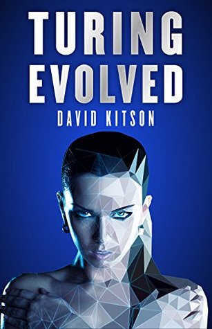
At first glance, I cringe. And then I look deeper. So too much blue. TOO MUCH. The brightness and contrast of the whitegrey font just hurts, but the font itself is good. I like the gradient effect. Just wish it didn’t sting my eyes.
But, kind of dig the concept of the pixelated girl. Not edited very well, but interesting idea. Is she a cyborg? Oh, read the write-up: Android. Ok fine. But she’s also an angel? HUH? That makes no sense people!
Agree with Lynn, the eye is just creepyness. I’ll definitely pass on this one.
![]()
Nothing about this cover works me. It looks unfinished, like the person drawing it walked off to the kitchen and never came back. There is so much going on that my eye doesn’t know where to focus.
I’m also a bit freaked out by the eyes. One human eye and one digital eye is seriously distracting.
On the positive side, the title font and background blue color are not as bad as it could be. The font is clean and is easy to read.
What are your thoughts on this cover?
Note: Some posts may contain affiliate links. Should you choose to purchase a product, we will receive a small commission for the sale at no additional cost to you. Chapter Break is a participant in the Amazon Services LLC Associates Program, an affiliate advertising program designed to provide a means for sites to earn advertising fees by advertising and linking to Amazon.com.


This one’s okay but I don’t love it. It definitely has a creepy-ish, android kind of feel, I’ll give it that, but it looks kind of amateurish to me, too? Not super crazy about it.
I agree with you on the amateurish, Greg. I’m not crazy for it, either.