We’re doing a feature here on Chapter Break called Chat About Covers. ‘Cause you know we all judge books by covers, whether we admit it or not. We judge the style, the color and font choices, and just the overall look. That might not keep us from reading the book, but we do still judge.

![]()
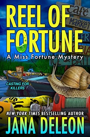
UGH this cover is painful. TOO MUCH GOING ON. Where do my eyes look? MY EYES!
I gotta say though, I do like the fonts. The cool poison in the O of FORTUNE is great. And the ombre effect on the author’s name. Also great.
The rest? Has to go. All of it. Especially the freaky snail. WTF?
![]()
Sometimes a cover attracts for one reason. And Reel of Fortune for me stood out right away with the giant snail. It both repulses and intrigues me. Which I guess is the cover doing it’s job. Though, the fact that the snail looks like it’s fishing with it’s mouth is just strange. And yes – it get it. Reel = fishing. But maybe move the reel over a bit?
Overall, hard pass for me!
What are your thoughts on this cover?
Note: Some posts may contain affiliate links. Should you choose to purchase a product, we will receive a small commission for the sale at no additional cost to you. Chapter Break is a participant in the Amazon Services LLC Associates Program, an affiliate advertising program designed to provide a means for sites to earn advertising fees by advertising and linking to Amazon.com.


I wouldn’t pick up a book with this style of cover. I like an atmospheric monochrome best and this one is just too crammed!
definitely crammed, Stephanie Jane!
It’s just too busy for my taste. And until I read a previous comment about the snail fishing, never caught that. But then, there is a lot going on.
Definitely a lot going on, Dana!