We’re starting a new feature here on Chapter Break called Chat About Covers. ‘Cause you know we all judge books by covers, whether we admit it or not. We judge the style, the color and font choices, and just the overall look. That might not keep us from reading the book, but we do still judge.
![]()
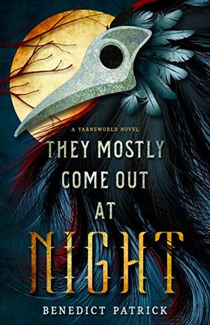
There’s just something intriguingly creepy about this cover. Enough so that I picked it up as a freebie deal of the day. I love the feathers, they’re so elegant and kind of regal looking. I like that most of them kind of blend into the background but a few red ones stand out.
And the plague mask is always a creepy touch and it works well here. Crisp, clean design.
The font is great. I like the thorns on the NIGHT and the slanty letters. I love that the color of the letters matches both the mask and the moon. Very good balance.
It definitely has a “Fantasy book” feel to it, which jives with the blurb. A fantasy/folklore creepy sounding story that has topped a bunch of lists. Yea I might have to read it someday.
![]()
What initially grabbed me with this cover is definitely the plague mask. It looks like a bird wearing the mask. Wouldn’t that be cool to see IRL! I also like the feathers, especially how they look like hair.
The moon silhouette is nicely placed in the background, off to the side so as not to pull the focus away from the figure, but enough to make a great background. I like the NIGHT font as well.
Overall, a well balanced and well designed cover. It did the job of grabbing our attention!
What are your thoughts on this cover?
Note: Some posts may contain affiliate links. Should you choose to purchase a product, we will receive a small commission for the sale at no additional cost to you. Chapter Break is a participant in the Amazon Services LLC Associates Program, an affiliate advertising program designed to provide a means for sites to earn advertising fees by advertising and linking to Amazon.com.


