We’re starting a new feature here on Chapter Break called Chat About Covers. ‘Cause you know we all judge books by covers, whether we admit it or not. We judge the style, the color and font choices, and just the overall look. That might not keep us from reading the book, but we do still judge.
![]()
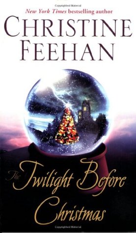
Holiday covers can be very cheesy sometimes. I’m glad this one is not. I like the crystal ball with the Christmas tree in it. I like that it’s kind of stormy and the star lights up so bright.
I’m so so on the title font. It’s a little too twirly whirly and not so readable. The author’s name is very prominent though.
So pretty good cover, not overwhelmingly Christmasy.
![]()
In case you are looking for a Christmas book to cross off some bingo squares – here’s one for you! It’s definitely sparkling and holiday themed.
I like the tree in the crystal ball as well. The scene inside the crystal ball is very warm and homey feeling. I really like how the background inside the ball flows into the background outside of it. The purple is a good choice through the who cover.
Overall, the cover is enough to catch my eye and read the book description.
What are your thoughts on this cover?
Note: Some posts may contain affiliate links. Should you choose to purchase a product, we will receive a small commission for the sale at no additional cost to you. Chapter Break is a participant in the Amazon Services LLC Associates Program, an affiliate advertising program designed to provide a means for sites to earn advertising fees by advertising and linking to Amazon.com.
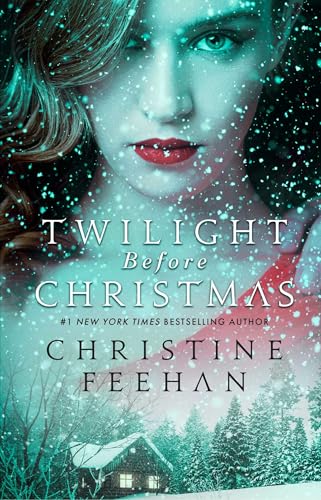

I see what you mean, Nicole. It does look like a crystal ball. Plus, the kind of hazy look does add a bit of an eerie element.
I like this cover, but it almost looks … spooky to me. I don’t know—I think that’s probably just me because I know that’s supposed to be a snow globe, but I somehow see crystal ball. LOL!
Nicole @ Feed Your Fiction Addiction recently posted…Briggs Book Tag
I kind of see that. It has a bit of a creepy element.