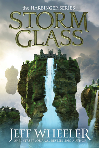
We’re starting a new feature here on Chapter Break called Chat About Covers. ‘Cause you know we all judge books by covers, whether we admit it or not. We judge the style, the color and font choices, and just the overall look. That might not keep us from reading the book, but we do still judge.

![]()
This cover has some interesting and creepy feeling going on.
The waterfall breaking the rock formation into faces is really a fun effect, and that’s what’s a bit creepy.
Also the gloomy effect is making it creepy. Like something ominous is happening.
Agree with Lynn the fonts are great and I like that they include the series name.
![]()
My initial reaction is, hey, that’s a cool cover. Then I actually looked at it. And I thought, hey, that’s a creepy cover! It’s definitely done the job of catching my eye.
I really dig the floating islands, both the ones that are face shaped and the others. It feels very other-world-y. The designers did a great job with the waterfall coming directly out of the castle, bisecting the island.
The fonts are well done. The title is prominent, and even includes the name of the series. The title and author’s name are well-placed to not cover up the artwork.
Overall, I’m interested enough to mark it as To Read!
What are your thoughts on this cover?
Note: Some posts may contain affiliate links. Should you choose to purchase a product, we will receive a small commission for the sale at no additional cost to you. Chapter Break is a participant in the Amazon Services LLC Associates Program, an affiliate advertising program designed to provide a means for sites to earn advertising fees by advertising and linking to Amazon.com.


