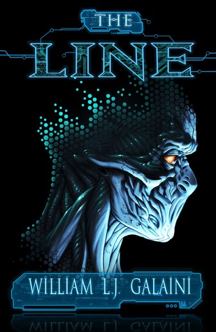
We’re starting a new feature here on Chapter Break called Chat About Covers. ‘Cause you know we all judge books by covers, whether we admit it or not. We judge the style, the color and font choices, and just the overall look. That might not keep us from reading the book, but we do still judge.

![]()
When Lynn showed me this cover, I was thinking “WOA what a creepy and cool and intriguing cover!” So I’m glad we chose this as our cover chat this month.
Just wow, the creepy alien robot looking thinger. I mean, can we say this looks like a fun new movie poster? But as a book? I’m not sure. Is it horror? Is it hard sci-fi? I’m not sure it’s my flavor.
But it intrigues. It gets my attention. It makes me do a double take. That’s what makes it a great cover.
The colors, they’re simple but complicated. The changing circle drop things coming off the alien head is a really neat effect.
I love the font use. I love how it’s outlined and how the author name and “the” are on an overlay of what looks kind of like a tech dashboard. The word “line” looks fab. The circuit board behind the outlined letters, such a great look.
It definitely makes me want to pick it up and flip it over. Which is a job well done by a cover.
![]()
Creepy cool. Tech-y. Alien. My instant gut reaction to this cover is: Nope. Hard pass. Looks scary.
I think the cover is well done. I like how the head is dissolving into pixels and how the yellow in the eye stand out against the background.
I like the block header look of the author’s name. It makes the name stand out from the rest of the cover. Plus carries over the sci-fi theme.
Overall, the cover does a great job of catching my eye. But doesn’t really make me want to read the book. 😕
What are your thoughts on this cover?
Note: Some posts may contain affiliate links. Should you choose to purchase a product, we will receive a small commission for the sale at no additional cost to you. Chapter Break is a participant in the Amazon Services LLC Associates Program, an affiliate advertising program designed to provide a means for sites to earn advertising fees by advertising and linking to Amazon.com.


Creepy enough to grab the attention of anyone – especially those who read that genre.
agreed, Dana!