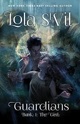
We’re starting a new feature here on Chapter Break called Chat About Covers. ‘Cause you know we all judge books by covers, whether we admit it or not. We judge the style, the color and font choices, and just the overall look. That might not keep us from reading the book, but we do still judge.

![]()
I think there’s a ton going on with this cover and when too much is going on, the eyes don’t know where to look.
The couple looks like they’re maybe in the rain, but maybe under water? Or maybe in a tunnel?
OH, are those Angel wings?
And there’s a city behind them?
The generally dark colors of the picture make it hard to figure out exactly what I’m looking at here.
Their posing is awkward, almost looks like there are too many hands going on. The blending might be the issue as it looks like you can see through the girl to the boy behind her.
The font, well isn’t easy to read. The font works great for the Author’s name, because it’s large and cool and swirly, but isn’t working for me for the title and subtitle. The “Book 1: The Girl” is so hard to read. Too much swirl. Too much overlap.
So generally not a fan of the style choices in this cover. But with the elements I would be curious to read the blurb.
![]()
I agree with Julie – WAY too much going on and I don’t know where to look! And after looking at it for longer trying to figure out what’s going on, I still don’t know.
I’m not a fan of the font in the title or the author’s name. Certainly not easy to read.
Where Julie sees wings, I’m looking at the heads of two komodo dragons. I do kind of see the city in the background, but the city looks like someone took a paint knife and pulled streaks down from the top.
Overall, I’d pass right over this book while silently judging it’s design.
What are your thoughts on this cover?
Note: Some posts may contain affiliate links. Should you choose to purchase a product, we will receive a small commission for the sale at no additional cost to you. Chapter Break is a participant in the Amazon Services LLC Associates Program, an affiliate advertising program designed to provide a means for sites to earn advertising fees by advertising and linking to Amazon.com.


