It’s the holiday season here on Chapter Break. Julie and I couldn’t decide which cover we wanted to chat about so we are chatting about three! ‘Cause you know we all judge books by covers, whether we admit it or not. We judge the style, the color and font choices, and just the overall look. That might not keep us from reading the book, but we do still judge. (Though we did agree not the chat about this one!)
![]()
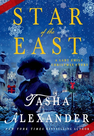
This cover is super gorgeous. I love the dark evening sky with all the snowflakes, big and small. The font is pretty for the T and A, just curly enough but thankfully only for the first letters and the rest is bold and easy to read. I love the streetlights in the background. The nostalgic feel of the woman in shadow, her hat. It all works for me. And I’m not a fan of typical Christmas book covers, so this one is great. I also like that it looks like it’s a wrapped present. 🙂
![]()
Oh yeah, I didn’t even notice that it’s wrapped like a present. Good eye, Julie! I like this cover, too. The silhouette and hat drew my attention right away. It tells me this is historical and probably right up my alley. I like the blue background with the yellow title. That works really well for me. The snowflakes are great as well. Overall, thumbs up from me.
![]()
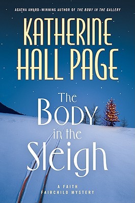
I’m not sure I like this cover. Where is the sleigh? Give me a sleigh on the cover! Not just tracks in the snow, and lots and lots of snow. I do like the font though.
![]()
Hah, Julie, I like this cover! The sleigh (and the body) are both missing! More blue and snow. I like the decorated tree in the background. And maybe (?) a hint of blood in the sleigh tracks. Definitely a mystery that I would check out.
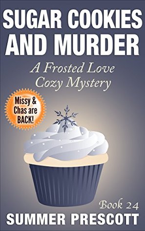
This one is a double feature since the Amazon cover shown below is different than the current Goodreads cover and book bub holiday covers list.
![]()
Two-fer! Love the Goodreads cover. I want to eat that cupcake so bad. And it makes me think of the Frozen II movie so I just really like the cupcake. The rest is OK, simple and unassuming. It definitely works, not too fancy but that’s what is needed after seeing so many busy covers.
The Amazon cover, no likey. TOO YELLOW. That’s what I’m talking about for the covers being too busy. Hurts my eyes. Look away.
![]()
I agree with Julie completely on the Amazon cover. TOO YELLOW. But I guess at least it has cookies on it and not a cupcake? That does make more sense with the title.
I also really like the Goodreads cover. That’s a pretty fancy cupcake that I would totally buy and eat. I like the sparkly frosting and that the series is “Frosted Love”. And yes, I agree, the simple cover is best in this case. Easy on the eyes.
What are your thoughts on these covers?
Note: Some posts may contain affiliate links. Should you choose to purchase a product, we will receive a small commission for the sale at no additional cost to you. Chapter Break is a participant in the Amazon Services LLC Associates Program, an affiliate advertising program designed to provide a means for sites to earn advertising fees by advertising and linking to Amazon.com.


I agree that the Star of the East cover is really eye-catching! And I wouldn’t have necessarily noticed the blood on the tracks on that second cover, but I think you’re right, Lynn!
And how funny that the book about sugar cookies features a cupcake! Still like it better than that yellow, though. 🙂
Nicole @ Feed Your Fiction Addiction recently posted…2019 Challenge Wrap-Up
Hah! I try to help with the blood in the snow tracks, Nicole!