We’re starting a new feature here on Chapter Break called Chat About Covers. ‘Cause you know we all judge books by covers, whether we admit it or not. We judge the style, the color and font choices, and just the overall look. That might not keep us from reading the book, but we do still judge.

![]()
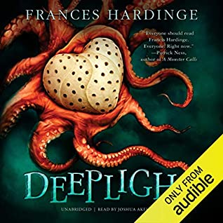
Oh my what a cover! Definitely eye-grabbing in an awkward creepy way. The octopus is a beautiful creature that is a bit spooky to look at (those tentacles!) but interesting. Who does the octopus represent? Friend or foe? An actual monster creature perhaps?
The heart? I’m not sure what to make of it with the pores or holes. The octopus is holding it. Is it a stolen object? A metaphor for love? I went and read the blurb, it got me curious, and now I know the heart belongs to a deity. So there’s definitely some paranormal magic going on.
The title font is perfect. The “DEEPLIGHT” in creepy letters. You can’t see the full version in the audible image above, but the full image in the info block shows one of the tentacles wrapped around a letter, which is a fun effect. I like.
I’ve never read this author but the overall look definitely would make me pick it up and think about it.
![]()
This cover grabbed my attention right away, with the octopus surrounding that heart. I actually thought is was a weird and giant crab at first look, but nope. Octopus it is!
I love the colors here and the feel of movement in the cover. The background of dark green makes me feel like I’m watching a nature documentary on the deep ocean. The salmon octopus and cream heart compliment the background well. The design is also well-centered, filling the space, but not over-filling it.
I also like the title font and color. It feels very wavy, like ocean currents.
Like Julie, I’ve never read this author, but am thinking about picking up this book.
What are your thoughts on this cover?
Note: Some posts may contain affiliate links. Should you choose to purchase a product, we will receive a small commission for the sale at no additional cost to you. Chapter Break is a participant in the Amazon Services LLC Associates Program, an affiliate advertising program designed to provide a means for sites to earn advertising fees by advertising and linking to Amazon.com.


