We’re starting a new feature here on Chapter Break called Chat About Covers. ‘Cause you know we all judge books by covers, whether we admit it or not. We judge the style, the color and font choices, and just the overall look. That might not keep us from reading the book, but we do still judge.
![]()
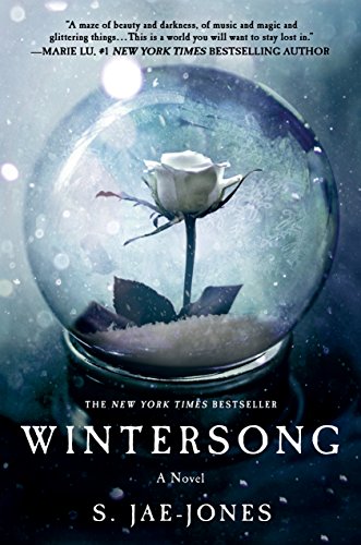
Oh my. This cover speaks to me. It’s so… elegantly lovely. It’s got that Beauty and the Beast element with the lovely rose under a glass container. From the little blurb bit at the top it does sound like a retelling perhaps?
I like the font choice, easy to read, good crispy letters.
I like all the white – definitely conveys cold and winter. I can almost feel the snowflakes.
This cover will definitely get me to pick up and flip the book over.
![]()
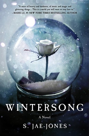
Right now, with the heat index in the triple digits, I really want to crawl inside this cover to cool off! I certainly feel the winter chill\ice vibe. I get the Beauty and the Beast feelings that Julie mentioned as well, especially with the single rose.
I like the white on grey color scheme, from the title and author to the snowflakes and (I’m going with) sand on the inside of the globe. It’s pleasing to my eye, almost calming. Definitely cooling. 😉
The font on the title and author name is easy to read, but still keeps the whole ‘winter’ theme going.
I’d pick up this book to read the back cover for sure!
What are your thoughts on this cover?
Note: Some posts may contain affiliate links. Should you choose to purchase a product, we will receive a small commission for the sale at no additional cost to you. Chapter Break is a participant in the Amazon Services LLC Associates Program, an affiliate advertising program designed to provide a means for sites to earn advertising fees by advertising and linking to Amazon.com.
