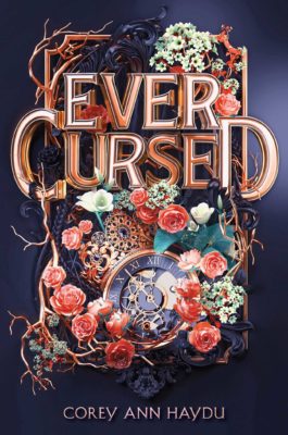
We’re starting a new feature here on Chapter Break called Chat About Covers. ‘Cause you know we all judge books by covers, whether we admit it or not. We judge the style, the color and font choices, and just the overall look. That might not keep us from reading the book, but we do still judge.

![]()
What a fun and funky cover!! And unique!
I’m a fan of things unique, since things get so repetitive and trope in book covers (and books).
I like this one, but it is a bit busy. I like the flowers and the clock, has a slight beauty and the beast feel with the time and curse and of course the roses. It also has a steampunk feel with the gears. Maybe a bit gothic as well.
I Love the font. Capital L. I haven’t seen this font before, so I’m a fan. It’s 3D and a bit twisty/curved, intertwined with the vines. Great picks!
Definitely curious to pick it up and read the blurb.
![]()
I agree with Julie that this cover is busy. But busy in a way that I like! I especially appreciate how the design is bursting out from the background frame, with the vines and the flowers. I would totally put something like this up on my wall.
I like the clock and gears, with the steampunk vibe. The colors also work for me. The muted rose tones, with the creams and blacks work well together.
The font is great as well. I especially like how the “C” and “D” in Cursed are off-kilter a bit to the rest of the word, like the vines are pulling the letters off the book.
Overall, I would definitely pick up this book and read the blurb! It’s certainly eye-catching.
What are your thoughts on this cover?
Note: Some posts may contain affiliate links. Should you choose to purchase a product, we will receive a small commission for the sale at no additional cost to you. Chapter Break is a participant in the Amazon Services LLC Associates Program, an affiliate advertising program designed to provide a means for sites to earn advertising fees by advertising and linking to Amazon.com.


Sorry…just too busy for my taste.
Thanks, Dana. And yes – I can see that. It is very busy!