We’re starting a new feature here on Chapter Break called Chat About Covers. ‘Cause you know we all judge books by covers, whether we admit it or not. We judge the style, the color and font choices, and just the overall look. That might not keep us from reading the book, but we do still judge.

![]()
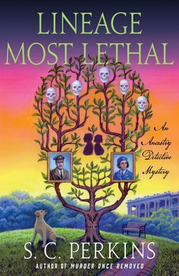
This cover is super creepy interesting. The overall skulls effect is fun. Kinda makes me think of that optical illusion meme that is floating around Facebook – the one about how many faces can you see. The tree being a skull illusion is neat.
It is quite literal when you’re talking about ancestry and lineage, but interesting take and makes me curious about the book blurb.
I do like the vivid colors used, kinda cool that it’s in a serene park with a bench and a dog, looking up into something perhaps sinister.
The font is good for the title and author, but the script font piece is hard to read.
Overall, I’m curious, not sure if I’d read it, but at least would flip it over.
![]()
Honestly, I have mixed feelings about this cover. I kind of like it. And kind of am creeped out. I think the family tree out of a tree idea is brilliant, especially with the family portraits at the bottom. And the skulls are super cool. But the overall image of the tree wigs me out. With the mean looking eyebrows and arm looking limbs.
I’m not so sure about the dog, either. Like what is he (she\it) looking at? The tree? The portraits?
I do like the background sunset colors. Those are pleasing to my eye.
The fonts are nothing special, but readable. Which sometimes is a real challenge!
I’d probably pick this book up to read the blurb at least. Which is the whole point of the cover – to grab my attention.
What are your thoughts on this cover?
Note: Some posts may contain affiliate links. Should you choose to purchase a product, we will receive a small commission for the sale at no additional cost to you. Chapter Break is a participant in the Amazon Services LLC Associates Program, an affiliate advertising program designed to provide a means for sites to earn advertising fees by advertising and linking to Amazon.com.


