We’re starting a new feature here on Chapter Break called Chat About Covers. ‘Cause you know we all judge books by covers, whether we admit it or not. We judge the style, the color and font choices, and just the overall look. That might not keep us from reading the book, but we do still judge.
![]()
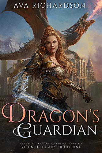
Oh look, this book is about dragons. The cover has sooo much going on. Too much. Too many images on top of each other.
I like the fire-breathing dragon in the background, but you can hardly see it. Maybe a flying dragon would have been better. But this is obscured by both the castle and the guardian warrior woman.
The warrior woman is kind of generic looking. Huge armor, cliche tough face expression. I do like her reddish shiny hair, kind of like she’s also firey like the dragon.
The sword tries to be too prominent. You know how I feel about sword covers. This isn’t that, but it being all lightening and bright in contrast to the faded everything else is confusing. Why is the sword more prominent? Is the sword the actual guardian? Is it magic?
I like the font. The color contrast and the curly font on the first letter of the title words is lovely. Definitely good choice there. And it stands out against the busy background so well done there.
![]()
What Julie said. Especially on the too busy. Maybe they should have stuck with one idea instead of throwing all the ideas at the cover.
I’m not really into the warrior woman on the cover. Her eyebrows are irritating. Also, what kind of armor leaves the entire top of the neck\chest open to attack? I know. It’s the kind designed by a man. Not a warrior who actually wears armor. Plus can she even breathe in that outfit?
I do like the font on the title. It swirls, but is still legible.
The landscape in the background seems pretty generic and pointless. I guess we need something for the dragon to fly over, though.
I’m generally into High Fantasy. But this cover does nothing for me. I’ll pass.
What are your thoughts on this cover?
Note: Some posts may contain affiliate links. Should you choose to purchase a product, we will receive a small commission for the sale at no additional cost to you. Chapter Break is a participant in the Amazon Services LLC Associates Program, an affiliate advertising program designed to provide a means for sites to earn advertising fees by advertising and linking to Amazon.com.


Great idea for a feature! I love looking at covers (good and bad).
The first thing I noticed here was her weird cross-eyed expression. To my taste the whole thing is too busy and too naturalistic for a fantasy book. I like things left a little more to the imagination.
Glad it wasn’t just me on the eyes, Lory!
I like it. I definitely lets the reader know there’s a bad ass chick about to put you in a fantasy story. I love dragons, so maybe I’m partial.
Freda Mans-Labianca recently posted…The #Friday56 & #Instagram56
Hah! You and Julie both on the dragons, Freda!