We’re continuing a favorite feature here on Chapter Break called Chat About Covers. ‘Cause you know we all judge books by covers, whether we admit it or not. We judge the style, the color and font choices, and just the overall look. That might not keep us from reading the book, but we do still judge.
![]()
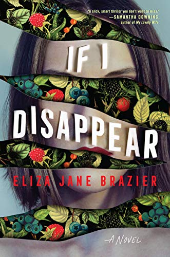
Ooh what a catchy book cover! I like the tears on the page along the face and head. It almost looks like the girl is disappearing into a wall – like the fruit is wallpaper design – or into the woods or garden. But it looks like she’s still looking at you, through the berries.
I like the lettering of the font, it almost looks like post-it notes placed along the tear over her face. The author’s name is not a good font color choice, as it does not contrast well with the chin area.
So the blurb is about a girl who goes searching for her favorite true-crime podcast host who goes missing. Interesting premise, for sure. Also, apparently, she gets “plunged” into the “wild backcountry” of California, which I guess goes with the wild berries.
I’d be curious to give this book a second look for sure.
![]()
Creepy. Freaky. Eye-Catchy. And I like it!
The combination of classic still life of berries with a modern photo works for me. The black background on the berries feels deep and very void-like.
One aspect that stands out is how the fruit is positioned just so to appear as the woman’s eyes. That is some good photo editing skills! I also like how the title font follows the curves\ribbon of face.
After reading the description, I’m not really sure what berries have to do with the missing person mystery. But the book did it’s job and caught my attention enough to read the description.
What are your thoughts on this cover?
Note: Some posts may contain affiliate links. Should you choose to purchase a product, we will receive a small commission for the sale at no additional cost to you. Chapter Break is a participant in the Amazon Services LLC Associates Program, an affiliate advertising program designed to provide a means for sites to earn advertising fees by advertising and linking to Amazon.com.


I don’t know – I’m on the fence. The cover is kinda busy and doesn’t really tell me anything about the book. When I read the blurb, I looked at the cover again and saw nothing to give that impression.
An intriguing cover. It does get your attention. I like the split concept of blending of the two main images along with the design of the title font. Very well done.
I tend to agree with the comment about the connection of the foliage to the blurb. For a thriller, the foliage doesn’t convey tension.
Technically, I would change the color of the author’s name, and either eliminate or increase the font size for the review comment at the top. When book covers get reduced to a thumbnail, small font becomes problematic.