We’re starting a new feature here on Chapter Break called Chat About Covers. ‘Cause you know we all judge books by covers, whether we admit it or not. We judge the style, the color and font choices, and just the overall look. That might not keep us from reading the book, but we do still judge.

![]()
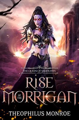
Wowza this cover. It sure is attempting a lot of things, isn’t it?
Let’s do mention some good things – I do love the font. The RISE and MORRIGAN are in a really nifty-looking font. And I like how “of the” sits inside the O in MORRIGAN. Good choice there.
But, I can’t read the above part Queen of something? It’s too blurry over the body.
Speaking of blurry, the whole image feels blurry to me. The girl, the background.
I get what they’re going for, a kick-ass fae wearing next to nothing, like faeries do, with pointy ears and all. But the girl is uncomfortable to look at with the poor quality of the image. And the magic in her hands looks off. Just not done well.
I’m going to stop staring at this cover now because it’s making me a bit dizzy.
![]()
Busy and blurry pretty much sums it up!
What gets me is the laser beam eyes. I can’t stop looking. But also I don’t want to look! And had Julie not mentioned pointy ears, I would have not even noticed them. The woman’s purple skin tone irritates me. Why is it not the same shade from head to toe? It’s like she was colored top to bottom and they ran out of purple ink before they could finish.
I do like the font, especially the snake-y looking S.
This cover certainly conveys fantasy and fae. But also does not interest me.
What are your thoughts on this cover?
Note: Some posts may contain affiliate links. Should you choose to purchase a product, we will receive a small commission for the sale at no additional cost to you. Chapter Break is a participant in the Amazon Services LLC Associates Program, an affiliate advertising program designed to provide a means for sites to earn advertising fees by advertising and linking to Amazon.com.


