We’re starting a new feature here on Chapter Break called Chat About Covers. ‘Cause you know we all judge books by covers, whether we admit it or not. We judge the style, the color and font choices, and just the overall look. That might not keep us from reading the book, but we do still judge.
![]()
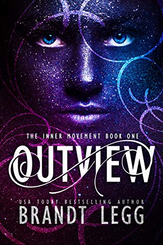
Wooowee what an eye-catching cover. I’m both intrigued and creeped out.
Ok so I do love the purples and reds and blues and color tones in general. My kind of color palate.
I’m not sure how I feel about the face. It’s something, for sure. Very striking. Better be something sci-fi and fun.
The font I kinda like. The author’s name font is great, and I like the texture. The main title is a bit on the too-twirly side but it looks good and readable.
I definitely would want to pick it up and read the blurb on this one.
Ok so I did read the blurb and it’s actually more fantasy thriller. And secrets, lots of secrets.
![]()
Initial thoughts? This better be a sci fi book with all those hints of space\stars. Sadly, not. It’s paranormal! I still dig the cover, though!
The overall design is stunning. The colors draw me into the eyes\face. Those eyes are piercing for sure. I wonder if it’s makeup or computer graphics? Here’s hoping for make up. I’d watch that tutorial for sure. The design also looks like the model is pushing through from the background. (Cough. Cough. You might want to read that description about now.)
The title font is neat – curly but still legible. I especially like that it ties together the other curly designs on the over.
Overall, the cover certainly caught my attention.
What are your thoughts on this cover?
Note: Some posts may contain affiliate links. Should you choose to purchase a product, we will receive a small commission for the sale at no additional cost to you. Chapter Break is a participant in the Amazon Services LLC Associates Program, an affiliate advertising program designed to provide a means for sites to earn advertising fees by advertising and linking to Amazon.com.


That cover is very striking, though I do agree that you might expect sci-fi because of all the stars. 🙂
Nicole @ Feed Your Fiction Addiction recently posted…Sunday Post: Book Pre-order Campaigns & Giveaways Galore – 5/23/21