We’re starting a new feature here on Chapter Break called Chat About Covers. ‘Cause you know we all judge books by covers, whether we admit it or not. We judge the style, the color and font choices, and just the overall look. That might not keep us from reading the book, but we do still judge.
![]()
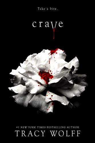
So I will say the cover is intriguing, maybe in the same way the Twilight covers are intriguing. And it feels the same. Like it’s a similar story. Obviously, it’s not in the same world, or by the same author, but the cover style is the same, and it is on purpose to trigger that reaction. If you loved this other book that looks just like this, pick me up. That’s what this cover says.
The blood on the V and the drops definitely tell me it’s a vampire book, like the other vampire book this parallels in style. The drops on the white carnation/rose look really cool, and definitely says this book is YA.
I do like the font, though the same use of the font throughout is kind of not as visually appealing. Maybe it’s the switching from all caps to all lowercase that feels off to me. I do like the black and white contrast.
But yes, I would definitely pick it up and read the blurb.
![]()
If you are looking at that book cover and thinking TWILIGHT, you and I are on the same wavelength! I’m right in the middle of reading this book and I can honestly say it’s totally campy, totally TWILIGHT, and highly recommended if you don’t take it too seriously!
This cover really works for me. It’s classic and simple, and still stunning. Without even reading the description, from the tag line, to the V, to the blood drips, you know vampires are involved. I really like the stark black and white with the red drops of blood. The shading around the flower at the bottom really makes it stand out on the cover. The fonts in the title and author’s name are clear and easy to read.
Authors and publishers take note – covers don’t need to be busy to catch our attention!
What are your thoughts on this cover?
Note: Some posts may contain affiliate links. Should you choose to purchase a product, we will receive a small commission for the sale at no additional cost to you. Chapter Break is a participant in the Amazon Services LLC Associates Program, an affiliate advertising program designed to provide a means for sites to earn advertising fees by advertising and linking to Amazon.com.


I’ve seen this book around a lot and the cover always catches my eye, so I agree that it does its job!
Nicole @ Feed Your Fiction Addiction recently posted…Bite-Sized Reviews of XOXO, The House in the Cerulean Sea, Greta’s Story, and The Beast Player
Exactly, Nicole! Good to see a cover design that works!
It definitely says vampire story to me. An interesting cover and if I read that genre, I would be intrigued by it.