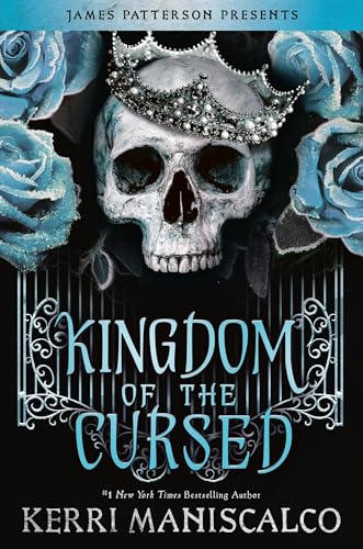
We’re chatting about covers on Chapter Break. ‘Cause you know we all judge books by covers, whether we admit it or not. We judge the style, the color and font choices, and just the overall look. That might not keep us from reading the book, but we do still judge.
![]()
Wowza! Now this is how you design a cover! I’m immediately drawn to it, for so many reasons.
The icy blue on the roses is gorgeous. The skull with the crown? I’m SOOO intrigued.
James Patterson? I’m in.
The gate is eerie and curious as of course is the skull. But I’m a fan of skeletons.
I love the font choices. The icy blue title is in such a beautiful and easy-to-read font. Love it. The author’s name is in a different yet also fitting font that is a good match.
I’ve actually added all 3 books in the series to my Goodreads TBR because of how fun the covers are, but this book 2 cover is my favorite of them all.
![]()
What, no pirates? I feel like this cover screams pirates. Just me?
Anyhow.
I totally dig this cover. (And yes, Julie’s correct. The other covers in the series are also awesome!) I especially like the blue tinge to the whole cover, from the flowers, to the title, to the background tint. Very cool. Literally and figuratively.
The crown’s jaunty angle has me hopeful that one of the characters will be a sarcastic smart-mouth. Which is just my type! 😉
This cover did it’s job – I also added the books to my Goodreads list!
What are your thoughts on this cover?
Note: Some posts may contain affiliate links. Should you choose to purchase a product, we will receive a small commission for the sale at no additional cost to you. Chapter Break is a participant in the Amazon Services LLC Associates Program, an affiliate advertising program designed to provide a means for sites to earn advertising fees by advertising and linking to Amazon.com.


Yep, I definitely judge covers lol. I agree this is a great one! The image is important, but the look of the title and author can make a big difference too, and this one incorporated them well.
Kit @ Metaphors and Moonlight recently posted…Book Review: Like Silk Breathing by Camille Duplessis
Oh, I definitely love this cover! I do agree it looks like it should have pirates, though. 🙂
Hah! Pirates for sure, Nicole!