We’re chatting about covers on Chapter Break. ‘Cause you know we all judge books by covers, whether we admit it or not. We judge the style, the color and font choices, and just the overall look. That might not keep us from reading the book, but we do still judge.
![]()
I wanted to find a Valentinesy cover but the book cover distribution system failed me. SO we get a random Romance cover instead.
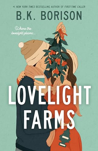
Yes it’s kinda Christmasy with the mistletoe covering their faces – so let’s start there. I don’t like it. Cover the entire faces with a giant branch? Why even have people on the cover then? Odd choice.
The air freshener is a weird touch. Like woo we smell so bad we gotta carry around an air freshener. What?
I’m on board with her holding coffee though. Like when it’s cold enough to be wearing a beanie there better be a hot beverage in my hand. Don’t make me spill it though with your weird branch covering antics.
The title font is, fine. Just fine. Nothing special, just a simple font. Author name font is fine too. No huge complaints but not exciting either. Except for the cursive part that’s small and not easy to read. Not a fan there.
So overall, nope not picking this one up. At all. And if you have a more valentinesy cover idea fling it our way and maybe we’ll do a second cover post this month!
![]()
Clearly this is a Christmas-y holiday cover and we are at Valentine’s Day. But let’s progress anyway!
Overall, I’m not a fan. First – the plant (holly? maybe?) covering the faces of the two main characters is distracting. Maybe better if that was actually above their heads instead of in their faces? Who wants a bunch of leaves in your face? Then what’s up with the air freshener tree? I imagine it have something to do with the Christmas tree farm plot – but then why not use an actual Christmas tree? Maybe the air freshener is an inside joke which makes more sense when you read the book? I’m also not a fan of that background color. It seems to class with all the other colors on the cover, especially the orange in the plant and dress.
I’m ok with the title font and author’s name. Both are easy to read.
I’d pass up this book based on the cover.
What are your thoughts on this cover?
Note: Some posts may contain affiliate links. Should you choose to purchase a product, we will receive a small commission for the sale at no additional cost to you. Chapter Break is a participant in the Amazon Services LLC Associates Program, an affiliate advertising program designed to provide a means for sites to earn advertising fees by advertising and linking to Amazon.com.


