We’re chatting about covers on Chapter Break. ‘Cause you know we all judge books by covers, whether we admit it or not. We judge the style, the color and font choices, and just the overall look. That might not keep us from reading the book, but we do still judge.
![]()
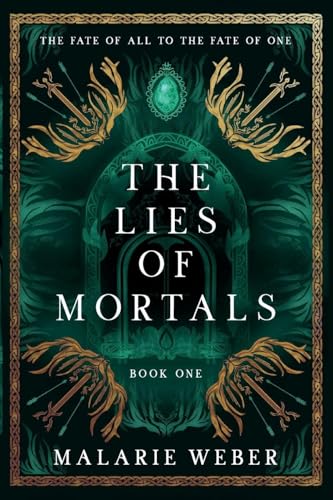
So not all sword covers are evil. There, I said it. Who am I? But this is kinda unique and curious. The swords are NOT the focal point. That’s the type of sword cover I can’t stand. These are just patterns on the corners. Are they in a crown looking thing? The stone? Ha. Can’t tell. Just decorations.
But the portal looking thing? So curious. It looks so spooky almost fog like. And I like the green.
I really like the font – clean, blocky, easy to read, stands out well.
This is a clean and simple design – not overly cluttered and easy to look at.
![]()
Swords! And a portal looking cover? Caught my eye! Plus I love the green\black color scheme!
This had a vibe for sure – and ghosts floating into that portal is the vibe. I also like the jewel at the top of the portal. It reminds me of the Magic Mirror in Snow White.
I appreciate the balance on this cover – with the same design in all the corners. The fonts are easy to read; I like that fancy H as well.
Overall, this cover caught our attention, and got me to read the description.
What are your thoughts on this cover?
Note: Some posts may contain affiliate links. Should you choose to purchase a product, we will receive a small commission for the sale at no additional cost to you. Chapter Break is a participant in the Amazon Services LLC Associates Program, an affiliate advertising program designed to provide a means for sites to earn advertising fees by advertising and linking to Amazon.com.