

We’re chatting about covers on Chapter Break. ‘Cause you know we all judge books by covers, whether we admit it or not. We judge the style, the color and font choices, and just the overall look. That might not keep us from reading the book, but we do still judge.
![]()
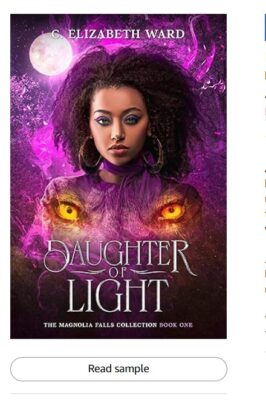
Ok I am not a fan of eyeballs that hover over someone’s chest like that. What a strange artistic choice.
I like the purple/mauve colors, and the girl looks really cool and fierce and I like her well defined arty facial features.
The title text is pretty, I like the swirly font. But the sub font and the author name font is hard to read.
I can’t tell if that’s tentacles or flames or what behind her, but that vortex is not well illustrated. It could be done much sharper and more clear.
The full moon feels very out of place with the rest of the vibe of the cover.
Overall, the cover is not very visually appealing to me. But it was offered as a freebie recently so I picked it up.
![]()
I think this cover would be ok if it weren’t for the eyes. And I agree with Julie. Weird aesthetic choice to put those eyes over the woman’s chest.
Overall, this cover has a witchy vibe, with the purple\black background and the moon in the corner. I think if we took out the woman and the random eyes, this cover would be much more appealing.
Font on the title is ok. I like the font on the author’s name better.
The cover catches the eye, pun intended. But not for me.
What are your thoughts on this cover?
Note: Some posts may contain affiliate links. Should you choose to purchase a product, we will receive a small commission for the sale at no additional cost to you. Chapter Break is a participant in the Amazon Services LLC Associates Program, an affiliate advertising program designed to provide a means for sites to earn advertising fees by advertising and linking to Amazon.com.


Leave a Reply