We’re starting a new feature here on Chapter Break called Chat About Covers. ‘Cause you know we all judge books by covers, whether we admit it or not. We judge the style, the color and font choices, and just the overall look. That might not keep us from reading the book, but we do still judge.

![]()
Reading the blurb, it’s kind of a mysterious story. Someone has secrets, lots of them. But reading the reviews gives away what that is. So I’ll go with that. Since the reviews say this is a very similar story line to Twilight, I’m going to talk vampires.
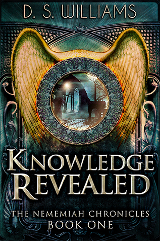
Knowing that the story is about vampires, I am so confused about the wings on the cover. Or are there angels too?
The cover looks a bit steam punky. Not supernatural. So I’m almost expecting airships or spooky old houses with secrete passages.
Super curious about why there’s that peep hole that looks like you’re looking into a different world, which would only make sense if the world was totally different – like a gateway or a portal, rather than supernatural living among us, which is what the reviews made it seem to be.
Generally, I do like the idea of the cover. And the eerie but inviting feel. The colors are great. I do like all the gold.
But it’s got too much going on. Too many elements. I don’t know where to look.
The Title font is wonderful. Love it.
![]()
Unlike Julie, I did not read the spoiler-y\vampire review. I’m going to stick with my impressions of the cover.
I do agree that the cover is way too busy. Is that a door in the background, with a window into another world? That’s what I think at least. I like the metal plates at the top. Very armor-like. The window\portal is cool. I like the idea of being able to peer into another world.
The wings on the cover do seem out of place. Certainly they are my focal point, and I’d think the book would have something to do with angels? Hawk-men? (Yes, my Flash Gordon is showing!) They don’t really match the quick blurb.
I like the colors and the font. Those are good choices.
Overall, I’d say this cover caught my eye. But didn’t intrigue me enough to want to read the book.
What are your thoughts on this cover?
Note: Some posts may contain affiliate links. Should you choose to purchase a product, we will receive a small commission for the sale at no additional cost to you. Chapter Break is a participant in the Amazon Services LLC Associates Program, an affiliate advertising program designed to provide a means for sites to earn advertising fees by advertising and linking to Amazon.com.


Oooh this is fun! I agree, I’d never in a million years guessed vampires from this cover! Like Julie, I’d have thought steampunk or angels, or maybe steampunky angels, but not vampires. It’s not terrible though!
Shannon @ It Starts at Midnight recently posted…Reviews in a Minute: MiddleMarch
Not my genre, but I agree… too busy!