We’re chatting about covers on Chapter Break. ‘Cause you know we all judge books by covers, whether we admit it or not. We judge the style, the color and font choices, and just the overall look. That might not keep us from reading the book, but we do still judge.
![]()
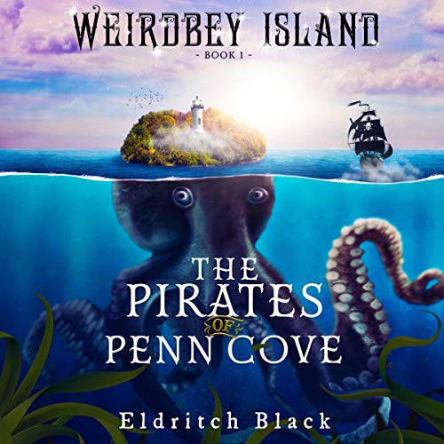
Ha, that’s a funny book cover. Love the octopus island, that’s creative and silly. I wonder if the giant octopus will grab the pirate ship and throw it. I just want it to throw it.
I do love a pirate story, and since I did read the blurb, I know it’s a Middle Grade book. That kind of explains the more colorful, bright, silly cover.
I do like the title font, fonts are my thing apparently. Great choice on style and the color contrast is also well done. It is easy to read over the ocean, octopus, and the seaweed.
The author font is less so, a bit small perhaps or not as easy to read in the italics feel of the font. The font up at the top, which is the series name, is also not as well done. The font does look similar to the title font, but also different. And the dark but sparkly font over the busy sky isn’t working.
I’m not sure I’d pick this up to even look at it but my son might?
![]()
Creative and silly and eye-catching for sure!
I’ve been obsessed with octopuses since reading Remarkably Bright Creatures; this cover fits the bill! Even more so with the fact that the top of the mantle is also an island. With a lighthouse! I’m hoping the pirates are trying to land there and the tentacles capture them!
I agree that the title font works. And yeah – the font at the top is difficult to read. Are those solar flares? Reflections? I don’t really get that.
I like how the cover is divided above and below the water surface. That is really well done, with the clouds and the water getting darker at the bottom of the cover. The kelp at the bottom doesn’t do much for me. I suppose it’s there to just take up empty space.
Overall this cover definitely caught my eye!
What are your thoughts on this cover?
Note: Some posts may contain affiliate links. Should you choose to purchase a product, we will receive a small commission for the sale at no additional cost to you. Chapter Break is a participant in the Amazon Services LLC Associates Program, an affiliate advertising program designed to provide a means for sites to earn advertising fees by advertising and linking to Amazon.com.


