

We’re starting a new feature here on Chapter Break called Chat About Covers. ‘Cause you know we all judge books by covers, whether we admit it or not. We judge the style, the color and font choices, and just the overall look. That might not keep us from reading the book, but we do still judge.
[easyazon_infoblock align=”none” identifier=”B07G8NZTR1″ locale=”US” tag=”chapbrea05-20″]
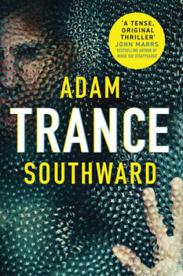
![]()
Oh wow this cover! It makes my skin crawl. Great effect on the spiky creepy glass? window? portal? Whatever that is. The hand pressing against it makes it look like someone’s trapped, or in trouble.
The circle sticker says the book is a thriller – but what kind? Sci-fi? Psychological? I’m kind of afraid to read the blurb to find out more.
Agree with Lynn on the author’s name being split up around the title. That’s just wrong and confusing.
Pass for me too, but the cover gets points for getting a real reaction out of me.
![]()
I had a visceral reaction to seeing this cover. A hard pass, demogorgons can eat me kind of hard pass.
Let’s have a list, shall we.
- The title in the middle of the author’s names is a personal pet peeve. Why do that?
- It looks like a face\eye rotated sideways on the bottom. That and the hand pressed up against the ‘glass’ is enough for me to not be interested in even reading the description of this book.
- Is that face a victim? or The bad guy? Does the hand belong to him? Or someone else? I don’t really know. And I’m freaked out.
- The dimpled appearance is really distracting. I’m a fan of pointillism, but this is definitely not an example I’d want to display.
Good news for you, if this cover intrigues you. It’s a Prime First Books for June. You can check it out yourself and report back. I won’t be checking it out!
What are your thoughts on this cover?

I kind of like this cover for what it is. I mean, it doesn’t make me want to read the book, but that’s just because I don’t enjoy these types of books. I think if I was a psychological thriller kind of reader, I’d actually go for this one. It’s definitely creepy!!
I think you are correct, Nicole. If psychological thriller was my genre, this cover would certainly grab my attention as well.
It’s interesting – I rather like the dimpled appearance. Not a fan of the title splitting the name. Would I read the back cover, yes.
Glad to see we are in agreement on the title splitting name, Dana! That’s just really distracting to me.