We’re starting a new feature here on Chapter Break called Chat About Covers. ‘Cause you know we all judge books by covers, whether we admit it or not. We judge the style, the color and font choices, and just the overall look. That might not keep us from reading the book, but we do still judge.
![]()
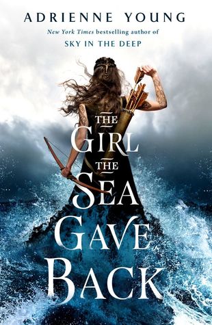
WOW this cover is pretty. Pick it up and really want to know what it’s about, eye-catching. Definitely makes me want to read the blurb. And makes me wonder if it’s a mermaid book?
I love how the girl is standing up, right out of the sea, looking like she’s wearing the ocean. She is a warrior of some sort, with all the archery, but also the pose is strong and powerful.
I love the font, and the way the ocean waves splash over the title words. Definitely a great cover.
![]()
Gut reaction? This cover is gorgeous! And completely did it’s job by capturing my attention. I didn’t even read the blurb description and I was ready to read it! (I MAY have put it on the book club suggestion list! 😉 )
I love how her dress flows into the wave and rocks. That is really what drew me in first. The action movement of the waves, as well as pulling the arrow out of the quiver makes me hope this would be a fast paced story. The title placement is well done. And the fact that it is the same shape as her dress and surrounded by the waves is great design work!
Overall, I’d call this cover design a win.
What are your thoughts on this cover?
Note: Some posts may contain affiliate links. Should you choose to purchase a product, we will receive a small commission for the sale at no additional cost to you. Chapter Break is a participant in the Amazon Services LLC Associates Program, an affiliate advertising program designed to provide a means for sites to earn advertising fees by advertising and linking to Amazon.com.