

We’re starting a new feature here on Chapter Break called Chat About Covers. ‘Cause you know we all judge books by covers, whether we admit it or not. We judge the style, the color and font choices, and just the overall look. That might not keep us from reading the book, but we do still judge.
This is a two-fer because the Goodreads cover is different than the Amazon cover.
Goodreads:
Amazon:
![]()
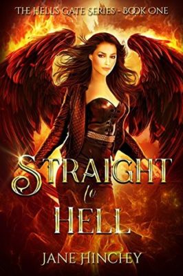
It’s so amazing to me to see how different these two covers are!
They both have wings and a token hot chick in leather. The styles are similar with the sparkling and the general feel for the cover.
I love the font for the title. The S in Straight looks like a serpent kind of. The font choice is great, easy to read – I like the block letters.
Interestingly, the Goodreads cover has the author’s full name vs. the Amazon one with the initials. So do we want to know the author is female or not?
The Goodreads covers is more hell-like – with the fires and the flames on the wings are a great look. The wings here look more feathery and beautiful, like a fallen angel. The title font color doesn’t contrast enough with the flames, though.
The Amazon cover is cool in contrast. The blue flames (I suppose that’s what they are) look quite fun. I don’t like the wings on the Amazon cover as much, but I like the color choices with the different blues, purples, and pinks. The title font color of silvery-white looks much better here and is much easier to read. I also dig the girl’s red hair.
Either cover works for me to want to pick it up and read more.
![]()
Similar but different is certainly the theme here. I do wonder why the covers between Goodreads and Amazon are not the same? The central figure is positioned (roughly) the same; the title is in the same font; but the main difference is the color palate.
I’l like a mash-up of my favorite aspects of the two covers to make a perfect cover.
- The more feathery wings on the Goodreads cover
- The cooler colors on the Amazon cover
- The hair style on the Amazon cover. (Actually, kind of jealous of that hair!)
On the Amazon cover, I like the water\fog\river along the bottom of the cover, like she’s standing in the water. That is neat!
And like Julie, I wonder why one book has the author’s initials and the other the full name? That’s an interesting choice.
Overall, yes, I’d pick up either cover to at least read the back and see what the book is about.
What are your thoughts on this cover?
Note: Some posts may contain affiliate links. Should you choose to purchase a product, we will receive a small commission for the sale at no additional cost to you. Chapter Break is a participant in the Amazon Services LLC Associates Program, an affiliate advertising program designed to provide a means for sites to earn advertising fees by advertising and linking to Amazon.com.


I agree that there are elements of both covers that I love. They seem very similar but oddly different.
Nicole @ Feed Your Fiction Addiction recently posted…The Wonders of a Writing Accountability Partner
yes, very oddly different, Nicole!