We’re chatting about covers on Chapter Break. ‘Cause you know we all judge books by covers, whether we admit it or not. We judge the style, the color and font choices, and just the overall look. That might not keep us from reading the book, but we do still judge.
![]()
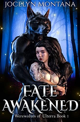
What the even. Can’t tell if the cover is a sarcastic spoof or if they are serious. So I do enjoy urban fantasy, though I’ve burned out on shifter romance books.
But this? This isn’t a smexy wereshifter; this is a scary nightmare creature. Bad AI perhaps? Personally? I wouldn’t be attracted to this monster creature, like at all.
And the girl? She kind has a weird vibe about her. I mean, she doesn’t look exactly human either. Might just be an aspect of the drawing style.
But usually these covers show more of the human girl, not as much of the scary towering monster enveloping her in his claws. But ok, stylistic choice I suppose. Just that she blends into his giant body of a similar color as her dark hair and it barely looks like she’s even there. But, her face is visible and she doesn’t look happy or in love. She kinda looks pissed? Or maybe, trying to make another jealous in her look what I have expression?
I do like the font, the silver color against the werewolf looks kinda ominous and interesting. The edges being angled are fun. I do like fonts like that.
The background forest is a cute drawing, I like how it’s more illustrated looking than real, but it would be better if the centerpiece couple looked more realistic.
![]()
TBH, this is exactly the reason I avoid urban fantasy and shifter books. If we concede that werewolves exist, would they stand on two legs or four? Would they use the other two forelegs to hug a woman? This is just all cringe to me!
Interesting that the woman’s hair is the same color as the man’s fur. I’d think a different color would contrast better. She does have that Snow White vibe going on, with the pale skin and ruby lips going on, which makes sense for a fantasy book.
I like the background, with the woods, moonlight, and fireflies. That’s pleasing to my eye.
The fonts are ok. It was a good decision to go with the slivery color. That stands out against the darker background.
Overall, I’d hard pass on this book. It doesn’t appeal to me at all. But hey. You do you!
What are your thoughts on this cover?
Note: Some posts may contain affiliate links. Should you choose to purchase a product, we will receive a small commission for the sale at no additional cost to you. Chapter Break is a participant in the Amazon Services LLC Associates Program, an affiliate advertising program designed to provide a means for sites to earn advertising fees by advertising and linking to Amazon.com.


