
We’re chatting about covers on Chapter Break. ‘Cause you know we all judge books by covers, whether we admit it or not. We judge the style, the color and font choices, and just the overall look. That might not keep us from reading the book, but we do still judge.
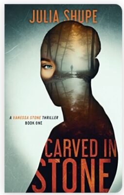

This eyeball is haunting me. This is definitely an eye-catching cover. haha.
Ok, but for real, it does get my attention and curiosity. It has a very horror/thriller feel to it. It is a simple but compelling cover.
I am a fan of the use of overlays in general, and the silhouette and spooky pond scene are nicely done. And the choice to make the eye up front, where the rest of the silhouette is an overlay of the scene, is very interesting.
I like the font color and style. It is easy to read and stands out well on the cover. But the overlap with the silhouette was kind of odd, with some of the sides of the letters cutting off. I didn’t like that.
Overall, an interesting cover and it grabs my attention, but thrillers are not typically my genre of choice, so I might not actually want to read it. Who knows.

Umm. No. This is not for me. Julie and I definitely have some opposite opinions this time around.
The creepy person walking through the woods in the overlay is freaky. Especially with that eye. Maybe if it was only the person walking through the woods, I’d be more inclined to like this cover. That eye definitely pulls in the viewer. It looks like the head and torso are turned away from the viewer. How does the back of the head (or maybe side) have an eye?
I actually like the title in the overlay with the cutoff letters. I think it fits with the creepy feeling of the cover. I also like the orange color in the title. It plays off the dark and foggy background well.
Overall, this does give thriller vibes. And overall, I’m not interested in scary books or scary book covers.
What are your thoughts on this cover?
Discover more from Chapter Break
Subscribe to get the latest posts sent to your email.

Leave a Reply