We’re starting a new feature here on Chapter Break called Chat About Covers. ‘Cause you know we all judge books by covers, whether we admit it or not. We judge the style, the color and font choices, and just the overall look. That might not keep us from reading the book, but we do still judge.
I’m going rogue this month and posting A LOT of cover versions for the same book. I’m kind of obsessed with Rainbow Rowell and I can’t decide which version I want to buy. Or do I buy ALL the versions!
Check out this link to see what the versions include.
~Lynn
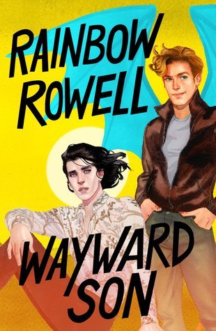
(Standard US Edition)
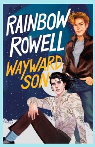
(Fancy Moon US Edition)
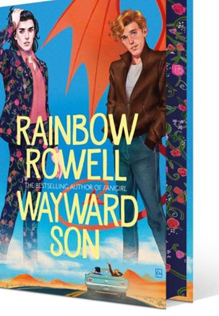
(Fancy UK Edition with MATCHING end paper!)
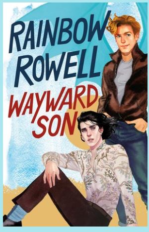
(Standard Canadian Edition)
![]()
Straight truth, I love the fancy UK Edition, with the Baz-Suit corresponding end papers. It would look gorgeous on my bookshelf! It’s definitely a go big or go home cover. And finally, a cover that tells the plot line of the book. The gang is on a road trip through the Southwest U.S. We get a car and a desert vista. Plus, we get the idea of Baz being a vampire (pale!) and Simon with wings and a tail.
The other covers are good as well. Balanced, with nothing overly dominating the cover. I like the fonts and colors. I especially like how it looks like the wind is blowing through their hair, just like while driving with the top down on the convertible. We see some personality and connection between Baz and Simon. The standard US edition (with the bright sun) makes me want to put on some sunglasses (and sunscreen) and read it by the pool. The moon edition makes me want to read while under the stars.
Clearly, I have all the feelings about these covers!
![]()
Totally have to agree the UK version is fab. Love the end papers matching the covers. Books with special binding or page decorations hold my heart. I also like how it has a different pose than the other 3, which are quite similar. The Canadian version, I can’t even figure out why bother to make it different. It’s barely different enough. Of the 3 similar ones, the fancy moon one gets my vote.
What are your thoughts on these covers? Help me decide which edition to buy!
Note: Some posts may contain affiliate links. Should you choose to purchase a product, we will receive a small commission for the sale at no additional cost to you. Chapter Break is a participant in the Amazon Services LLC Associates Program, an affiliate advertising program designed to provide a means for sites to earn advertising fees by advertising and linking to Amazon.com.