

We’re starting a new feature here on Chapter Break called Chat About Covers. ‘Cause you know we all judge books by covers, whether we admit it or not. We judge the style, the color and font choices, and just the overall look. That might not keep us from reading the book, but we do still judge.
A two-fer this month. On a green theme.
![]()
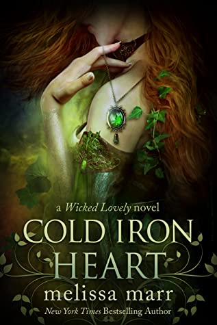
Melissa Marr covers have always drawn me in. They are crazy gorgeous and so enticing for the genre I enjoy reading. She catches me with the cover art, gets me to add to my neverending TBR. Yet, for some reason, I can’t say I’ve ever read a Marr book. Hmm.
I love all the green. I love the elegance and the brushes. The gem hanging on her shoulder is curious.
I’m confused by the bright light effect on her wrist. Was it meant to be on her shoulder? Is she holding some kind of green glowing orb?
I like the font. The blocky gradient letters are perfect. And I like how the author’s name is always lowercase on her books. Kinda a cool effect.
Yea so this is on my TBR now. Should I ever get to it.
![]()
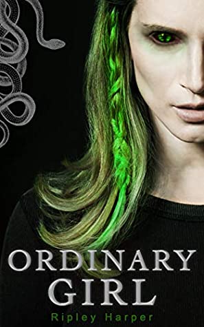
This cover has a very ethereal feel to it – and certainly strikes me as a ‘fantasy’ novel right away.
I like the green colors with the red hair of the cover model; it makes me think the setting might be Ireland or Scotland (or some created place like that). The leaves and the gem work well together. The light poking through is a nice touch as well.
The fonts of the title, book series, and author’s name work well on the cover. I like how they are all easy to read, but yet different fonts.
I put this on my TBR as well!
![]()
Yay for more green covers. Though the green is about all that works for me here. While the above cover is full of gorgeous designs and brushes and illustrations – this is lacking. Something is missing from the cover. It’s just, I feel the void.
The creepy snake eye is a cool though. I’m gonna assume with snake illustration on the side that the girl is a shifter. The braid is cool, but her otherwise appearance is kinda meh. Black shirt on black cover. No thank you.
The font is OK. I like the dark silver but the GIRL being bigger than ORDINARY in font size kinda throws me off. The author’s name is hard to read.
This would be a pass by for me.
![]()
The green braid is what catches my attention initially. And I think it’s cool. I would totally do that to my hair!
Snakes are not my thing; I find the rest of this cover to be pretty creepy. I do like the color scheme, with the silver drawing and writing along the black background. The green snake-like eyes also stand out on the cover.
I agree with Julie’s assessment on the font. The GIRL being larger than ORDINARY makes me think they were using justify on the type setting, making the words fit across the cover. I’m not really a fan.
I’ll pass on this book as well.
What are your thoughts on these covers?


Note: Some posts may contain affiliate links. Should you choose to purchase a product, we will receive a small commission for the sale at no additional cost to you. Chapter Break is a participant in the Amazon Services LLC Associates Program, an affiliate advertising program designed to provide a means for sites to earn advertising fees by advertising and linking to Amazon.com.
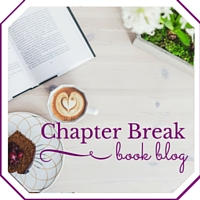

Love the first cover! Very enticing..the color, design, font – all is appealing. The second one, not so much, though I do think the half view with the wicked eye is kinda cool.
Good point on the wicked eye, Dana. I hadn’t thought about that!