
We’re chatting about covers on Chapter Break. ‘Cause you know we all judge books by covers, whether we admit it or not. We judge the style, the color and font choices, and just the overall look. That might not keep us from reading the book, but we do still judge.
This month, two covers to entertain us. To paraphrase Miley Cyrus, it’s my birthday and I can do what I want to. Plus, we all know how much Julie loves a good sword cover. 😉
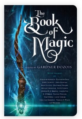

Hey these are pretty cool covers. I do really like the first one. The blue/green is beautiful and the magic lighting all ethereal around the wand. I like how the wand is kind of twisted and really detailed.
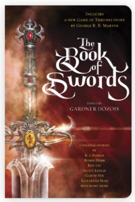
I’m not as fond of the second cover, as Lynn said, me and sword covers have a conflict of interest. As in, I am not interested. There has to be more than just a sword. But, this sword is quite pretty. Good detail and design, which is more than most of my unliked sword covers. And I do like the smokey aspect. But the orange/red isn’t doing it for me.
The Title font is fabulous! Love it! Fun and swirly and well done with the easy to read aspect. The other fonts are quite small, and there appears to be a lot of names on these covers in tiny fonts. I see these are anthologies so it makes sense to list out the authors included, but it’s too much text on the cover.
I also like the continued style between these anthologies. It shows they are part of an ongoing group and not just random thoughts. Covers in a series even when standalones or anthologies like this look so much better when they match.

I saw The Book of Magic cover first (looking for new Scott Lynch books). And I fell in love. The wand. The dark background. The font. It all evokes magic to me.
I adore the wand portion of the cover. With the stars, the magic-feeling whispy-ness and especially the gem light flare at the bottom. The whole image is amazing.
The font works here, swirling and evoking old Medieval books. I also like how the contributing authors are included on the cover.
Since we were talking about The Book of Magic, I thought, what the heck, let’s talk about The Book of Swords as well! While the Swords book was actually published first, I’m impressed by how well the style between the two books is cohesive.
The same font style also works here. Not all of the authors are listed, but enough of the authors to grab my attention.
The sword elicits fantasy right away to me. Jewels on the on the hilt. More light flares. I can certainly see some of our favorite fantasy characters carrying this sword. Though, it does look more decorative than practical for actual sword fighting.
Neither of these books are new releases. But if I can see myself grabbing both. Especially the anthology format.
What are your thoughts on this cover?
Discover more from Chapter Break
Subscribe to get the latest posts sent to your email.

While these probably wouldn’t be my kind of reads right off the top of my head, I do think the covers are nice and go well together. Thanks for sharing! And happy birthday!
https://lisalovesliterature.bookblog.io/2026/07/04/e-galley-review-the-lure-of-wolves-and-whispers-the-martyred-isle-1-by-amanda-connolly/